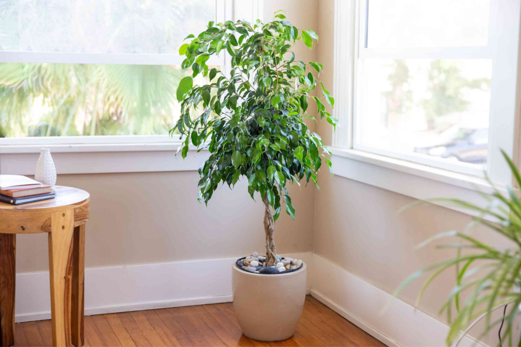
The ficus tree is one of the top choices of all artificial plants for home decor. This plant is tall, full, and elegant; just right for adding warmth and liveliness to your living room!
However, if you do not style an expensive artificial ficus correctly, then it can look flat. But when you implement just a few simple tips, your tree will look quite real.
This guide explains everything, from the selection of the right tree to the finishing touches that will make all the difference. If you are a first-time buyer or looking to upgrade the ficus you already have, these tips will help you get the most natural look possible.
Choosing the Right Ficus Tree
An artificial ficus tree is available in varieties. Some of the most common types include ficus benjamina, with its small glossy leaves and fine branching character, and the fiddle leaf fig, with its large sculptural leaves and strong visual impact, better known as ficus lyrata.
The trunk can also be braided to give the base a beautiful appearance. Each type has its own character. So it is worth giving some thought to which type best suits your home’s style before you buy.
When selecting a tree, look at its size, colour and shape of the leaves. A small tree will look diminutive for the space, while a tree that is oversized will overwhelm the whole room. HRtrees offers artificial ficus trees in various sizes to help you pick the right one for your space.
Search for leaves that have natural color variations. Real ficus leaves are not all the same shade of green, so a good faux tree should reflect this variation.
Assessing the Placement
The location where you decide to put your ficus tree is just as important as how it looks. The best place for your potted ficus is basically the same place where a real tree would be placed. A window or a bright corner are the most obvious choices. Putting your fake ficus in these places makes it believable to the eye since that is exactly where a live plant would be found.
If you are going for a more comprehensive approach to your home decor, you can try coordinating your ficus placement with hidden doors ideas for a multi-layered, well-thought-out and very characterful scheme. Don’t leave it stuck in a dark, neglected corner, the kind of place where a real plant wouldn’t be able to survive. That will immediately make one suspect it is fake.
Light has a big impact on the appearance of a ficus tree. The light streaming into the well-lit window will create a shadow of the leaves on the floor as they will be moving. If natural light is limited, warm-toned floor lamps or spotlights angled at the tree can produce similar results.
Fluffing the Foliage
Artificial ficus looks more convincing if it is fluffed up nicely. In fact, you may just find it to be the most important step in making your faux ficus look more lifelike. But more often than not, we tend to skip this step completely. Most artificial trees are shipped with the branches tightly packed together. The tree appears rigid, flat and unquestionably artificial without fluffing.
Begin with the lower branches first, working your way up pulling each branch outwards, away from the trunk. Next, place the smaller sub-branches and individual leaves so they fan out naturally.
The goal is to create some depth and dimension to the tree. Real ficus trees have layers – some leaves play supportive roles in front; some tuck deeper inside; some catching light at diff angles. Purposefully place branches, some more forward and others further back, to create this effect.
Adding Natural Elements
One of the easiest ways to make an artificial ficus seem more real is to incorporate true natural elements around its base. The plastic base of the artificial trees is the biggest giveaway so you must cover it.
Adding a layer of real potting soil or dried moss on top of the base gets these close to real. Both are affordable and easily found in garden centers and craft stores.
For extra texture and visual richness, add a layer of decorative stones, pebbles, or river rocks on top of the soil or moss. This is exactly what you would see in a well-styled real plant pot.
Choosing the Right Pot
The shape and size of the pot you choose can make or break the overall look of your ficus tree. A cheap or mismatched pot immediately detracts from the tree itself.
Choose a pot that is proportional to the size of the tree, so as a rule-of-thumb, the pot should be about a third of the height of the tree. Using materials such as terracotta, ceramic, concrete and woven seagrass helps reinforce the illusion of the presence of a live plant.
Colors like white, sand, charcoal and earthy brown won’t take away the attention from ficus foliage. After you place the tree in a pot, completely cover its artificial base with moss, soil, or stones.
Incorporating Lighting
Lighting has an incredible magic that can change the way your artificial ficus tree looks. A very popular and effective technique is to weave warm white string lights through the inner branches of the tree.
The soft beam coming through the leaves casts a gentle glow which adds a warmth and touch of magic to the whole room. It works best in spaces such as a living room or bedroom where you want a cozy effect.
For a more dramatic effect, a spotlight or an uplighter aimed upwards from the tree’s bottom can throw tree branch shadows onto the foliage above. Nevertheless, the best light by far is natural light. A ficus placed by a bright window will have that soft shifting light and shadow on its leaves that no man-made lighting can really replicate.
Conclusion
Styling an artificial ficus tree to look real is all about the details. Each styling step we’ve talked about builds on the last to create a convincing and beautiful result. These measures are simple and inexpensive but together they make a huge impact.
Feel free to play around and make the tree your own; you cannot go wrong with it! Switch up the branches, use another pot, add or swap the stones or even a string of lights will change it. An artificial ficus that is well styled it is a design statement that gets warmth, texture and life into your home every day of the week.
Creating a productive environment for remote work is more important than ever. The right furniture can completely transform your daily routine. This guide helps you find coordinated furniture sets that offer both style and function.
Investing in quality ergonomic solutions is a smart move. A good setup supports your body and boosts focus. Many retailers offer significant savings when you buy a matched set, sometimes 15-20% less than buying pieces separately.
This means better value for your investment. Specialized sources, like FindOfficeFurniture.com, provide curated selections and expert advice. They help you evaluate options based on quality, warranty, and your specific needs.
Current trends show high demand for these solutions as hybrid models continue. Choosing the right combination addresses ergonomics, aesthetics, and the unique demands of your professional environment.
Key Takeaways
Coordinated furniture sets can transform a remote work area into a highly productive space.
Bundling a desk and chair often leads to direct cost savings compared to individual purchases.
Quality ergonomic design in a bundle supports long-term health and improves daily focus.
Specialized retailers offer expert guidance to match furniture to your specific work style.
Evaluating bundles should include checks on construction quality, features, and warranty coverage.
The right set merges functional needs with personal aesthetic preferences for a better environment.
Introduction to Home Office Desk & Chair Bundle Deals
The shift to permanent remote work has sparked a surge in demand for coordinated furniture solutions. A complete desk chair set provides a unified look and significant financial benefits. Retailers frequently offer discounts of 15-20% on these packages.
This approach simplifies the selection process. You get pieces designed to complement each other in scale and style. The functional synergy between a chair set and its matching surface enhances daily comfort.
Brands like Herman Miller exemplify this trend. Their “Better Home Office Bundle” promotion saves customers 15% on a selected office chair, work surface, and an accessory. Such offers make premium home office furniture more accessible.
Evaluating a desk chair package requires looking past the initial price. Consider materials, adjustability, and warranty coverage. Solutions exist for every budget, ensuring long-term value from your office furniture investment.
Understanding the Components of a Successful Home Office Setup
The core of any effective remote environment lies in its fundamental pieces: the surface you work on and the seat you occupy. These two elements form the foundation of your daily workspace. Their quality directly affects your comfort, posture, and concentration.
Your primary work surface must handle computer gear, papers, and specific tasks. It needs enough room for movement and organization. A well-sized workstation prevents clutter from building up during long sessions.
Supportive seating is equally vital for your body over hours. Look for adjustable features that promote proper spinal alignment. Good seating reduces fatigue and prevents discomfort from poor design.
Productivity in a home office depends on ergonomic harmony. Correct alignment between your surface height, seat adjustments, and monitor placement is key. This setup minimizes physical strain while boosting efficiency.
Beyond the basics, consider lighting, storage, and organizational tools. These keep your workspace functional and free from distracting mess. A tidy area helps you maintain focus throughout the day.
Think about how your configuration matches your work patterns. Do you need space for video calls or spreading out documents? Your ideal layout depends on whether you use one screen or multiple.
The psychological effect of a well-designed workspace is significant. A professional, comfortable area helps separate job life from personal life. This boundary enhances both output and overall balance.
Home Office Desk and Chair Bundle Deals
Today’s market presents a wide array of coordinated furniture collections designed to fit specific spatial requirements. Modern Office provides a desk chair set configured for 8′ x 8′ spaces and larger 12′ x 15′ areas. These pre-measured sets ensure your furniture fits perfectly.
The price for quality collections varies significantly. Entry-level office desk and seating bundles start around $400. Premium executive suites can exceed $3,000 for comprehensive solutions.
Purchasing a coordinated package offers clear value. Modern Office’s U-shaped workstation, for instance, is listed at $2,699—a savings of $1,801. This makes high-end home office furniture more accessible.
When evaluating these sets, look for essential features. Proper lumbar support in the chair and cable management in the desk are crucial. Retailers also offer quantity discounts, ideal for furnishing multiple workspaces.
Budget Considerations and Price Ranges
Navigating the cost landscape for professional-grade workspace furnishings requires understanding where value truly lies. The price for a complete desk chair set can vary dramatically.
Entry-level combinations start around $400. Mid-tier office furniture ranges from $1,000 to $2,500. Premium executive suites can exceed $4,000.
Consider the chair set and desk separately. A basic task chair may cost $100, while a high-end model like the Herman Miller Aeron runs $1,168 to $2,020. Desks follow a similar pattern, from simple $200 surfaces to sophisticated sit-to-stand models priced over $1,800.
Investment in quality office furniture is an investment in daily comfort and long-term productivity.
Remember to budget for additional items. Monitor arms, cable management solutions, and lighting are often necessary. These items add to the total price but enhance functionality.
Promotional bundles offer significant savings. Retailers frequently provide discounts of 10-25% on coordinated collections. This makes a higher-quality desk chair set more accessible.
Evaluate the total cost of ownership. A cheaper chair might need replacement in a few years. Quality pieces often come with warranties of 5 to 12 years, offering better long-term value for your office.
Materials and Design Trends in Home Office Furniture
Modern workspace furniture trends blend minimalist aesthetics with durable, high-performance materials. Clean lines and uncluttered surfaces define the current design philosophy.
For desk surfaces, wood remains a foundational choice. Options range from practical laminate finishes, like Charcoal Woodgrain, to premium solid wood veneers in walnut or ash.
Laminate materials offer scratch resistance and easy cleaning. They provide consistent color options that fit a modern scheme.
Seating materials have also evolved. Premium chair models use breathable mesh backs and molded plastic shells.
Upholstered seats with high-density foam are another popular type. These materials combine comfort with lasting support.
Contemporary color palettes favor neutral bases. Think graphite, mineral, or white frames.
Personality comes through accent color choices in fabric. Brands like Herman Miller offer dozens of options, from olive to vibrant blues.
The line between residential style and professional furniture is blurring. Pieces now complement various interior design themes.
Sustainability in materials is a growing design consideration. Manufacturers use more recycled content and responsibly sourced wood.
Essential Features to Look for in a Home Office Desk
When evaluating a work surface, key functional elements separate basic tables from true productivity hubs. Essential features begin with adequate space for your computer gear and materials.
Standard desks range from 48 to 60 inches wide. Larger L-shaped or U-shaped desk configurations provide over 70 inches for complex setups.
Adjustable height functionality is a top priority. Sit-to-stand models, like Herman Miller’s Renew collection, let you switch between seated and standing positions.
Integrated storage significantly boosts functionality. Look for designs with multiple drawers, hutches, or coordinated cabinets.
These keep supplies organized and file storage within reach. Proper cable management is another critical feature for a clean workspace.
Additional enhancements include built-in power outlets and monitor mounts. Choosing a desk with these features ensures long-term comfort and efficiency.
Selecting the Perfect Chair for Your Workspace
Choosing the right seating is a critical decision that impacts your daily well-being and output. A proper desk chair supports the natural S-curve of your spine. It positions your feet flat and keeps your arms at a comfortable 90-degree angle.
Adjustable height is the most vital feature in any office chair. This setting lets you align your thighs parallel to the floor. Your eyes should meet the top third of your monitor to prevent neck strain.
True comfort extends beyond first impressions. Look for seat depth adjustment, precise lumbar support, and customizable armrests. Breathable materials prevent heat buildup during long sessions in your task seat.
Premium models like Herman Miller’s Aeron ($1,168–$2,020) and Embody ($1,556–$1,936) incorporate advanced ergonomics. Their designs adapt to individual body types and movements. Mid-range options, such as the Sayl chair ($644–$1,160), offer excellent features at more accessible prices.
Consider if your office needs a standard task chair or an alternative like a drafting stool. Stools with extended height ranges work well with standing desks. They reduce fatigue while maintaining an active posture.
Customization Options for Personalized Home Office Style
Your workspace should be a true reflection of your personal taste and professional needs. Modern furniture provides extensive options to achieve this.
For seating, premium brands offer vast color selections. The Herman Miller Sayl chair comes in 16 upholstery options. The Eames Executive model provides a stunning 30 fabric and leather choices.
These selections let you match existing décor or create a bold focal point. Your style shines through these deliberate choices.
Work surface finishes dramatically affect the look of your space. Light veneers like white ash promote an airy feel. Rich walnut tones add warmth and traditional elegance.
Consider the type of base or frame for both desks and chairs. Sleek cantilever designs offer a modern statement. Classic four-leg types provide timeless stability.
Storage customization tailors your setup to exact workflows. Options include hutches, side cabinets, or open shelving. This flexibility adapts your room for physical files or digital tasks.
Modular pieces increase room layout flexibility. Desks with reversible returns or stackable storage units can be reconfigured later. This future-proofs your investment.
Creating a cohesive style involves coordinating finishes and hardware. Match wood tones between your desks and storage pieces. Select chair fabrics that complement your wall color for a unified look.
Integrating Technology to Boost Workspace Productivity
Technology integration transforms a basic workspace into a high-performance command center. Your computer gear must fit seamlessly with your physical setup. This harmony directly fuels daily productivity and focus.
Monitor positioning is a critical factor. Tools like Herman Miller’s Flo Monitor Support enable precise height and angle adjustments. Proper screen placement reduces neck strain during long work sessions.
Standingdesk technology has evolved with smart features. Modern models offer programmable memory settings and sit-stand reminders. These tools encourage movement and enhance work efficiency.
Cable management is essential for a clean environment. Simple clips or under-desk trays organize computer peripherals. A tidy space minimizes distractions and supports productivity.
Keyboard height affects comfort and typing speed. Maintain a neutral wrist position to prevent strain. Smart office sensors can even track your sitting patterns.
Integrate video conferencing tech thoughtfully. Position your workspace relative to light sources for a professional look. This ensures you present well during virtual meetings.
Power management systems with built-in USB hubs are valuable. They keep computer equipment safe and charged. Such integrations create a truly efficient work environment.
Ultimately, a tech-optimized office supports sustained focus. Every tool, from monitor arms to standing controllers, plays a role. The goal is a seamless, distraction-free zone for deep computerwork.
Top Vendor Spotlight: https://www.findofficefurniture.com/
For those seeking curated options and expert advice, dedicated furniture resources are invaluable. A site like FindOfficeFurniture.com serves as a comprehensive guide. It aggregates information on desk chair set options and vendor comparisons.
This helps you navigate the fragmented marketplace for home office furniture. Practical vendors like Modern Office offer distinct advantages. Based in Eden Prairie, Minnesota, they accept purchase orders and provide quantity discounts.
Their chair set and surface combinations are designed for specific spatial requirements. Configurations range from compact layouts to expansive executive suites. This ensures a proper fit for your unique workspace.
Sourcing through specialized vendors grants access to professional-grade equipment and staff who understand ergonomic needs.
In the premium segment, Herman Miller offers an extensive collection. Their “Better Home Office Bundle” provides 15% savings on coordinated purchases. Their catalog features over 125 products for the remote environment.
When evaluating a vendor, look beyond the initial price. Consider shipping timelines, assembly services, and warranty coverage. Reliable support for adjustments protects your long-term investment.
Key advantages of using specialized sources include:
Access to professional-grade office furniture and knowledgeable guidance.
Comprehensive warranty programs that safeguard your purchase.
The ability to view sets in person at regional showrooms.
Collection diversity for every budget and style preference.
Vendor reputation matters for major investments. Research customer reviews and business longevity. This ensures you select reliable partners for your home office furniture needs.
Insights from Industry Pricing and Purchasing Trends
Industry pricing patterns reveal strategic opportunities for savvy buyers. Current promotional activity shows consistent 15-20% discounts at major retailers.
Brands like Herman Miller offer 20% off seating and 15% savings on bundles. Modern Office demonstrates deeper markdowns, with a U-shaped workstation dropping from $4,500 to $2,699.
Smart timing aligns with seasonal sales cycles. The best periods are back-to-school months and New Year promotions.
These windows offer the deepest price reductions on quality items. Purchasing trends favor coordinated sets for their clear value proposition.
Market segmentation defines distinct tiers:
Budget options range from $300-$800 total.
Mid-range office furniture spans $800-$2,500.
Premium suites exceed $2,500 with superior materials.
Long-term value considers warranty length and replacement cycles. Investing in durable items often yields better cost-per-year over time.
Increased price transparency helps buyers spot genuine deals. Research before buying is now a standard step for major workspace investments.
Incorporating Style and Functionality in Your Home Office Setup
Design-forward furniture proves that style and functionality are not mutually exclusive. Iconic pieces like Herman Miller’s Nelson Swag Leg Desk serve as both a functional workspace and a design statement. This approach creates an environment that inspires work while reflecting personal taste.
Your room‘s existing architecture sets the stage. Consider wall color and finishes as the backdrop for furniture choices. Light walls pair well with darker desk finishes like walnut for visual definition.
Deskstyle selection balances practical needs with design preferences. A traditional writing surface suits classic interiors. Sleek glass-and-metal configurations complement contemporary spaces for computer tasks.
Storage solutions significantly impact both style and utility. Options range from open shelving that displays items to closed cabinets that hide clutter. This maintains minimalist aesthetics in your workspace.
Effective space planning ensures a functional arrangement. Allow adequate clearance around your desk for movement. Position furniture to maximize natural light without creating computer screen glare.
Writing and digital work often need different configurations. A writingdesk offers a flat surface. A computer station integrates cable management and monitor supports.
Wall-mounted storage and floating shelves maximize floor space. These elements draw the eye upward, making a room feel more spacious. They provide essential storage for books and supplies.
Function-focused design includes thoughtful storage placement. Keep frequently used items within arm’s reach. Ensure task lighting supplements ambient room lighting for close work.
The most successful designs achieve harmony between style and function. Select quality pieces that perform reliably. Create an environment where the design itself supports focus and productive work.
Sustainability and Durability in Office Furniture Selections
Selecting furniture with lasting quality and eco-conscious design is a smart investment for any workspace. Sustainable practices now influence material sourcing and manufacturing. This approach reduces environmental impact while delivering products that endure.
Durability directly affects both ecological and economic value. Well-constructed pieces function reliably for over a decade. They eliminate the waste of frequent replacements.
Quality construction features solid joinery and robust hardware. Finishes resist scratches, stains, and fading. Premium chairs often include extensive warranties, showing manufacturer confidence.
Sustainable choices include responsibly harvested wood and recycled materials. Low-VOC finishes maintain indoor air quality. Certifications like GREENGUARD verify these standards.
The true cost considers lifespan, not just purchase price. A durable desk may have a higher initial cost. Its annual expense over fifteen years is often lower than cheaper alternatives.
Regular maintenance extends furniture life. Simple care routines keep mechanisms smooth. This ensures your workspace remains functional and attractive for years.
Final Thoughts on Optimizing Your Home Office Environment
The journey to a perfect personal workspace culminates in selecting furniture that aligns with your daily rituals. This investment supports your professional success and physical comfort. A quality desk and chair combination forms the essential foundation.
Your setup should evolve with your changing needs. Start with core pieces that accommodate current work requirements. Choose items offering flexibility for future adjustments.
The room you select sets the stage for effectiveness. Prioritize areas with good light and minimal distraction. This separation helps maintain focus during work hours.
For ongoing research, resources like FindOfficeFurniture.com provide valuable guidance. They help refine your home office as preferences evolve.
Remember, true productivity depends on more than furniture. Consider lighting, organization, and technology integration. Your final workspace must meet your unique needs and inspire your best work.
Doors don’t get nearly enough credit. We swing them open, push them shut, and barely give them a second thought, yet they’re quietly doing some of the heaviest lifting in your entire home. They define spaces, shape moods, manage light and sound, and set the first impression your house makes on every single person who walks up to it.
In modern home design, doors have evolved far beyond their basic function. Today, they’re a design statement, an architectural tool, and a surprisingly powerful way to tie an entire interior together. Whether you’re building from scratch or giving your home a refresh, understanding how doors work in modern design can completely change the decisions you make.
Let’s walk through it.
Why Doors Matter More Than You Think
Most homeowners spend hours agonizing over paint colors, countertops, and flooring, and then pick a door almost as an afterthought. That’s a missed opportunity.
Doors occupy a unique position in design: they’re both functional and decorative, structural and stylistic. They frame transitions between rooms, control how natural light flows through a space, and even affect how large or small a room feels.
A poorly chosen door can clash with an otherwise perfectly designed room. But the right door? It pulls everything together in a way that feels almost effortless.
First Impressions Start at the Front Door
Your front door is the handshake your home offers the world. Before anyone sees your living room or your kitchen, they see that door. And in modern design, front doors have become genuinely bold, deep charcoal blacks, rich navy blues, warm terracottas, and even matte forest greens are all popular choices right now.
Beyond color, the style matters enormously. A sleek, flush door with minimal hardware signals a contemporary, minimalist aesthetic. A door with glass panels brings in light and hints at openness. A solid-wood door with natural grain conveys warmth and craftsmanship.
The front door is where your home’s personality begins. Treat it that way.
The Big Shift: How Modern Design Changed the Door Game
Not long ago, doors were fairly standard: a panel here, some trim there, painted white to match the baseboards. Functional, forgettable.
Modern home design has completely rewritten that script.
Open Concepts and the New Purpose of Interior Doors
The rise of open-concept living changed how we think about interior doors. When walls came down, doors had to become more intentional. Now, instead of simply separating rooms by default, interior doors are chosen deliberately to add privacy when needed, to create a visual anchor, or to introduce texture and material contrast.
Sliding barn doors became enormously popular for this reason. They offer the charm of a door without eating up swing space, and they add a rustic-meets-modern texture that works beautifully in open-plan homes.
Pocket doors are another smart solution; they disappear entirely into the wall when open, keeping sightlines clean and spaces feeling expansive.
Floor-to-Ceiling Doors: A Game-Changer
One of the most striking trends in modern design is the use of oversized, floor-to-ceiling doors. When a door extends from floor to ceiling, it creates an immediate sense of grandeur and height even in a room that’s not especially large.
These doors work particularly well in:
Main bedroom entrances
Home offices or libraries
Living rooms that connect to outdoor patios
Open hallways that need a strong visual statement
The effect is dramatic without being overdone. It’s the kind of detail that makes a home feel genuinely designed, not just decorated.
Materials and Finishes: What’s Working in Modern Homes
The materials you choose for your doors communicate a lot about your home’s overall design language. Here’s what’s trending and why it works.
Wood: Timeless, Warm, and Endlessly Versatile
Natural wood doors remain a go-to choice in modern design, but the way they’re used has changed. Instead of painting over wood grain, designers are now celebrating it. Walnut, oak, and white ash are particularly popular for their rich, distinctive textures.
A natural wood door against white walls creates a beautiful contrast. It adds warmth to spaces that might otherwise feel cold or clinical, which is a common challenge in very modern, minimal interiors.
Glass Panels: Letting Light Do the Work
Glass-paneled doors have become a staple in modern homes, and for good reason. They allow light to travel through the home, reducing the need for artificial lighting during the day and creating a sense of visual continuity between spaces.
Frosted or fluted glass is especially popular right now; it lets light through while maintaining privacy, making it a versatile option for bathrooms, home offices, and bedrooms.
Steel and Metal Frames: Industrial Meets Elegant
Steel-framed glass doors, often called Crittal-style doors, have made a major comeback in modern design. The thin black metal frames create a striking grid pattern that looks architectural and intentional. They work particularly well as room dividers, between kitchens and dining spaces, or as the entry to a home office or wine room.
This style bridges the gap between industrial and refined. It’s bold without being aggressive.
Functionality Meets Design: Smart Features in Modern Doors
Modern doors aren’t just beautiful, they’re getting smarter. Homeowners and professionals working with platforms like doors for pros are increasingly looking for doors that combine strong aesthetics with practical performance.
Acoustic Insulation
In homes where open-plan living is the norm, sound management becomes a real challenge. Modern interior doors with solid cores and good seals offer meaningful acoustic insulation useful for home offices, media rooms, and bedrooms.
If you work from home or simply value quiet, this is worth taking seriously. A hollow-core door might look fine, but it does almost nothing to block sound.
Energy Efficiency in Exterior Doors
Exterior doors play a surprisingly significant role in your home’s energy efficiency. A well-insulated exterior door helps regulate indoor temperature, reduces drafts, and lowers your energy bills. Modern doors designed for performance often feature:
Multi-point locking systems for a tighter seal
Thermal breaks to prevent heat transfer
Weather stripping that actually holds up over time
This is an area where investing in quality pays off in measurable ways, both in comfort and in long-term costs.
Smart Locks and Integrated Technology
Smart locks have made door hardware genuinely exciting. Keypad entry, fingerprint recognition, and app-controlled locks are no longer novelties; they’re practical tools that fit seamlessly into modern home design. The best ones are designed to blend with the door’s aesthetic rather than disrupt it.
Color: The Unexpected Power Move
Color is one of the most underrated tools in door design. The right color choice can make a door disappear entirely or turn it into the focal point of a room.
When to Go Bold
Bold front door colors, deep black, navy, olive green, and burnt orange, work well when the rest of your exterior is relatively neutral. The door becomes an anchor, a deliberate choice that gives the home character and edge.
Interior doors can carry bold colors, too. A dark green door at the end of a white hallway creates a sense of depth and destination. It makes walking down that hallway feel like moving toward something, which is exactly what good design should do.
When to Stay Subtle
In very busy or layered interiors, a door that matches the wall color (sometimes called a “stealth door”) can be the right call. It keeps the space feeling calm and uncluttered. This approach works particularly well in rooms with lots of pattern, texture, or artwork. The door steps back and lets everything else breathe.
Matching Doors to Your Home’s Overall Design Language
One of the most important principles in modern home design is consistency. Your doors should feel like they belong, not like they were chosen from a different catalog entirely.
Here’s a simple way to think about it:
Minimalist or Scandinavian homes: Flat-panel doors, natural wood or white, simple hardware
Industrial-style homes: Steel frames, concrete textures, matte black hardware
Maximalist or eclectic homes: Patterned glass, bold colors, ornate handles
The door should speak the same design language as the rest of the space. When it does, the whole home feels cohesive and considered.
Professionals sourcing for clients often turn to specialized suppliers’ doors for pros being one example, to find options that match exacting design specifications without compromising on quality or lead time.
Hardware: The Detail That Ties It All Together
Door hardware is easy to overlook, but it’s the equivalent of jewelry on an outfit. The wrong handle on an otherwise beautiful door is like wearing mismatched accessories, technically fine, but something feels off.
Modern hardware trends favor:
Lever handles over round knobs for ease of use and cleaner lines
Matte black and brushed nickel for contemporary spaces
Unlacquered brass for warmer, more organic interiors
Minimal backplates for a sleeker, more refined look
Keep hardware consistent across your home. Switching between finishes room to room creates visual noise that’s subtle but real.
Conclusion: The Door as a Design Philosophy
There’s a reason architects and interior designers spend real time thinking about doors. They’re not background elements; they’re active participants in how a space looks, sounds, and feels.
A thoughtfully chosen door can make a room feel taller, warmer, quieter, or more dramatic. It can reinforce your home’s entire design identity or, if chosen carelessly, quietly undermine it.
The next time you walk through a door in a beautifully designed space, pause for a second. Notice how it fits into the room, how it handles light, how it feels in your hand. You’ll start to see that what once seemed like a simple functional object is actually one of the most carefully considered elements in the whole design.
Good design hides its own effort. Doors, when done right, are the perfect example of that.
Most people spend months researching the right architect for a resort home. They pour over portfolios, compare structural approaches, and discuss load-bearing walls at length. Then, almost as an afterthought, they circle back to find an interior designer — as if the look and feel of a space where they will actually live, unwind, and create memories somehow deserves less thought.
That imbalance is quietly costly. In resort towns, the wrong designer choice doesn’t just produce a room that looks a little off — it produces a space that fights against its surroundings, misses the local vernacular, and ends up feeling like a hotel lobby transplanted into a mountain setting.
Hiring the right interior designer in a place like Aspen, Sun Valley, or Park City is a craft unto itself. The parameters are tighter, the expectations are higher, and the environment demands a kind of fluency you simply can’t fake.
Here’s what to actually look for.
Why Resort Towns Are a Different Ballgame
A resort town is not just a pretty backdrop. It’s a living design constraint. The altitude, the climate, the material supply chain, the seasonal workforce — all of it shapes what’s possible and what’s practical.
Take snow load. A designer who primarily works in, say, Miami won’t instinctively think about how heavy drapery might block emergency egress when the power goes out and the drifts pile up outside a back door. They won’t know which local vendors actually deliver on time during peak ski season, or that certain imported stone takes three months to arrive — a detail that could derail a project timeline by an entire season.
Then there’s the texture of resort town living itself. These homes are often second residences, which means they need to feel special from the moment someone walks through the door after a flight and a long drive — not after two weeks of settling in. They need warmth, ease, and a certain deliberateness that full-time residences can slowly accumulate over years.
Understanding all of that before a single fabric swatch is pulled — that’s the baseline competency you’re looking for.
Local Knowledge Is Not a Bonus — It’s the Foundation
There’s a temptation to hire a big-city designer and fly them in. The portfolio is gorgeous, the name carries weight, and the showroom in New York or LA feels appropriately impressive. But local knowledge in a resort town market is genuinely irreplaceable.
A designer embedded in the community knows the permit office, the subcontractors who are worth the premium, and the ones to avoid. They know which furniture vendors have mountain-appropriate inventory and which ones will leave you waiting through two seasons for a sofa that’s backordered.
They also understand the visual language of the place. Good mountain design isn’t about stuffing reclaimed wood into every corner. It’s about knowing when restraint creates more warmth than abundance — when a clean line and a carefully placed stone fireplace says more than a room full of antler chandeliers.
What local knowledge actually looks like in practice
During your first conversation with a potential designer, listen for:
• Specific references to local suppliers, craftspeople, or artisans
• Awareness of seasonal delivery and construction windows
• Understanding of how light shifts across different orientations and elevations
• A natural fluency with the architectural style common to the area — not just the aesthetics, but the logic behind them
The Architecture-Interior Alignment Question
One of the most underappreciated aspects of resort home design is how tightly the interior and architecture need to speak the same language. When they don’t, the result feels fractured — like a stunning building wrapped around a space that could have been anywhere.
The best resort town designers either have architectural training themselves, work in firms that bridge both disciplines, or have a long track record of close collaboration with local architects. This isn’t just a resume-box to tick. It’s a proxy for how they think about spatial flow, proportion, and the relationship between what’s built and what’s placed inside it.
Ask any designer you’re considering: how early do you typically get involved in the build process? A great answer involves early-stage collaboration — weighing in on ceiling heights, window placement, material choices that will carry through from exterior to interior. A weak answer involves showing up after the drywall is done.
How Aspen Interior Designers Set the Standard
Aspen has long been considered a benchmark for how resort town design should work. The combination of an architecturally literate client base, a demanding natural environment, and a deep pool of skilled local talent has produced a design culture that is genuinely hard to replicate.
Firms that have grown up in this environment, like Ali & Shea Design, have internalized what it means to design for this specific context. Their work spans both architecture and interior design under one roof, which means the transition between what a home looks like from the outside and how it feels from the inside is seamless, considered, and cohesive.
This integration — where the same creative vision guides the building envelope and the interior experience — is what separates a truly special mountain home from a well-finished one. It’s also the standard worth holding any designer you consider to.
Questions That Separate Good Designers from Great Ones
A portfolio can only tell you so much. What you really want to understand is how a designer thinks — especially when things don’t go to plan. Here are questions worth asking:
About their process
• How do you approach a home that’s used only seasonally versus a full-time residence?
• Can you walk me through how a recent project evolved from first concept to final install?
• How do you handle a situation where a key piece is delayed or discontinued mid-project?
About the local context
• What local materials or craftspeople do you regularly work with?
• How does the mountain environment influence your material choices — especially durability and maintenance?
• What’s a design decision you’ve made specifically because of the climate or elevation here that you wouldn’t make elsewhere?
About fit and working style
• How involved do you want your clients to be? How involved do I need to be?
• What does your project management process look like when I’m not on site?
• Can you share a reference from a client with a similar project scope and timeline?
The Practical Side — Budgets, Timelines, and Scope
Resort town design projects often come in larger than clients initially expect. Part of this is simply the market — labor costs in isolated mountain communities are higher, materials need to travel further, and the logistical complexity of building during a seasonal window adds a premium.
A designer who helps you understand this early — who gives you a transparent picture of what full-service design actually costs, where contingency budget is likely to be needed, and how to sequence decisions to avoid expensive changes later — is invaluable. One who undersells the scope to win the project and then manages budget surprises reactively is an expensive headache.
Ask upfront about how they structure fees — flat rate, hourly, percentage of procurement, or a hybrid. None of these is inherently better than another, but the right answer for your project depends on its scope and your working style. A firm that has done dozens of similar projects will have strong, well-reasoned views on this.
Trust Your Instincts About the Relationship
Everything above is analytical. But the relationship you build with an interior designer is a deeply personal one. These are people you’ll be sharing your tastes, your habits, your family dynamics, and sometimes your frustrations with over a period of months or years.
Pay attention to how a designer listens in that first conversation. Do they ask more than they speak? Do they seem curious about how you actually use spaces, or are they already mentally decorating? Do they push back thoughtfully when you describe something that might not serve you well?
The designers who produce the most extraordinary resort homes are almost always the ones who are genuinely absorbed by their clients’ lives — who design not toward an aesthetic ideal, but toward the specific, irreplaceable way a particular family moves through a space.
The Space You Deserve Starts with the Right Partner
Hiring an interior designer in a resort town is not a luxury add-on to a construction project. It is the decision that determines whether a beautifully built structure actually becomes a home — one that feels at home in its landscape, serves the people who live in it, and endures beyond whatever trend dominated the year it was finished.
Take your time. Ask the harder questions. Look for designers who have built real fluency in the place you’ve chosen to put down roots — even seasonal ones.
Because in the end, a great interior designer doesn’t just make your home look beautiful. They make it feel inevitable — as if it could only ever have existed exactly this way, in exactly this place.
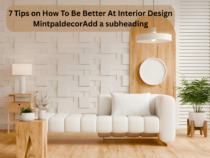
With a little thought and creativity, you can make a stylish & confortable living area wanting any qualifications or a big budget. When moving into a new house or feeling uninspired in your current one, learning how to be better at interior design mintpaldecorcan change your outlook on the everyday experience of your surroundings. The combination of creativity and functional ability creates a perfect world for self-expression. It is about making conscious choices that reflect your lifestyle while creating spaces that feel as good as they look. This complete guide outlines key concepts, helpful ideas and inventive design techniques that improve your designing ability and help you create the home of your dreams without overdoing it all.
Understanding the Fundamentals of Great Design
Before color swatches and furniture catalogs, one must understand the key principles that govern all successful interior designs first. The balance, proportion, rhythm and harmony create spaces that feel right even if you can’t quite put your finger on it. By balance, we mean the visual weight of a room that can be symmetrical, asymmetrical, or radial. Proportion is the balance between objects in a space; it is related to what feels too large or too small. When you take home upgrading advice mintpalment; you must know these basics to avoid filling your spaces with random furniture pieces but rather creating a whole look.
The Psychology Behind Color Selection
Color has a great power over feelings and perception of space. Beautiful shades like blue, brown & yellow energize an area & make intimacy. This makes them a good choice for social spaces like dining rooms and living spaces. Soothing shades that include blue, green and purple are relaxing and work well in bedrooms and bathrooms. Neutral palettes remain eternally in vogue allowing the swapping and changing of accessories without renovations. This is why interior design is interesting mintpaldecor– the same space can feel totally different easily by changing its shades scheme.. Don’t be afraid of color. Start with a shade you love, then build from there. Add it to the trial with the 50-20-10 rule: 55% dominant shade, 20% secondary shade, 10% accent shade.
Mastering the Art of Space Planning
Great space planning is the backbone of a good design. Often when we move into a new home we find ourselves recognizing what you have purchased does not suit your new decor style. Adding how you virtually utilize every space, instead of how you trust you must apply it. If you never have formal dinners, maybe that dining room would work better for you as a home office or library. When designinghome upgrading mintpalment projects, realistic(space planning prevents expensive errors, such as purchasing furniture that is too large or creating poor traffic patterns. Allow enough space for walking between your furniture, make sure doors can open completely and design conversation areas that feel cozy but not cluttered.
The Critical Role of Lighting
The lighting can make or break even the best-designed room. The backdrop of windows should always be set up to let maximum light in and won’t block the sunlight. Use layers of light by ambient lighting which illuminates the entire space, task lighting for doing activities like cooking or reading, and accent lighting that highlights a feature. What is the most important thing in interior design mintpalment? Lighting features high on the list of most important things because lighting affects the way we perceive every other design element. Use dimmer switches for flexibility, opt for warm bulbs in living areas for coziness, but don’t rely solely on overhead fixtures which create harsh shadows and flat atmospheres.
Selecting Furniture That Works
Selecting the correct furniture is significant as it is an expenditure. When it comes to items like sofas and mattresses, which you’ll use every day, it pays to spend a little more on quality furniture instead of budget furniture. On items driven by trends which you won’t mind replacing in a few years, you can certainly spend less. Scale is important; measure doorways to ensure that pieces actually enter your home, and check that furniture dimensions work with your room size. The Mintpaldecorprinciple states that everything should have a reason to be there and more so in smaller spaces. Storage ottomans, sleeper sofas, extendable dining tables, multi-purpose furniture helps you maximize versatility while looking chic.
Creating Depth Through Texture and Pattern
Whether the individual pieces are beautiful or not, if a room is done totally in one texture, it will feel flat. Add a different texture to each layer by pairing smooth leather with nubby linen, rough wood with sleek metal, soft velvet with cool glass that brings tactile richness. Bringing patterns together injects energy and personality; however, they should be mixed carefully. Use different scale patterns by pairing a larger print with smaller geometric designs using a colour palette to tie the different patterns together. When you are thinking of home upgrades mintpalment, adding texture can be impactful while being temporary. You can include pillow covers, carpets, curtains & wall fabrics.
The Final Touches That Count
Accessories and artwork turn ordinary rooms into your own personal oasis that tell your story. Nonetheless, it is important to resist putting too many decorative items otherwise the overall will be cluttered and fail to have impact. Organize collections, preferably in odd numbers, as they look better than even number collections. To add interest, vary the height and shape of your objects and remember to incorporate negative space. When applying interior decoration tips mintpaldecor, bear in mind to edit as much as add. Change your seasonal accessories often for variety but invest in a few quality items rather than a whole bunch of low-quality ones that cheapen the overall look.
Conclusion
Learning is the best thing you can do to master interior design, experimentation as well. These principles offer a great starting point, but what matters most is making spaces that are true to you and support how you really live. There is no need to feel pressured to be perfect or to follow every trend. Think carefully and be intentional about your choices that you’ll love forever.
Small changes can have a big impact, so choose smaller projects to start with to build confidence and upskill yourself. Whether you are making tiny changes or planning a total renovation, the important thing is to have a working knowledge of design elements, trust your instincts and be patient. If you follow these guidelines and develop an eye for design you will soon discover learning how to be better at interior design mintpaldecor is not that hard and can be very enjoyable as you watch your living spaces transform.
In the process of establishing or renovating an office, the selection of the appropriate office furniture to be sold is a very important process. Office furniture is no mere beauty object, as it concerns the productivity, comfort, and the general work atmosphere. Assessing the quality, design and long term value of furniture would enable the businesses make informed investments that can help both the employees and the organization. This guide is the breakdown of the essential considerations to make when buying office furniture.
1. Assessing Furniture Quality
Office furniture must be durable and comfortable, which is achieved by quality. Quality furniture guarantees durability and eliminates the necessity of changing the products frequently, which may economize in the long-run.
Key aspects of furniture quality include:
Material: Search hard wood, better metals or good plastics. No quality material or cheap particleboard can appear good but may easily wear out in the long run.
Construction: Screws, check joints and general construction. Well-built sculptures are heavyweight.
Posture: Chairs and desks must have good posture and minimize the tension. Lumbar support desks and chairs which can be adjusted up and down are specifically helpful in relation to health and comfort.
During shopping, it is not necessary to be shy about trying furniture. Sit on the chairs, open drawers and make everything comfortable and firm.
2. Evaluating Design and Functionality
Design is not just about aesthetics, design has an effect on workflow and office configuration. Contemporary offices need stylish furniture which is at the same time practical.
Consider these design factors:
Layout Compatibility: Ensure furniture fits your office layout without overcrowding the space. Modular furniture is capable of giving versatility to make alteration.
Storage: The desks, the cabinets and shelves ought to aid in keeping the working areas neat and clean.
Design: Select a style based on a brand of the company and its culture. Modern sleek designs may be used to promote professionalism whereas comfortable lounge chairs may be used in lounge to provide a positive environment.
Functionality: Functionality is enhanced by such features as adjustable desk, movable pedestal, or multi-purpose table and tends to adjust to the evolving office requirements.
Their selection of office furniture at Meet&Co has compromised between modern design and functional utility such that businesses have found it easy to acquire items that not only appear good but also work well.
3. Understanding Long-Term Value
The purchase of office furniture cannot be done in haste because it is long enduring. When the furniture can be of high quality, it might be more expensive in the initial stages but offer more durability, satisfaction of the employees, and productivity advantages.
Factors affecting long-term value include:
Durability: The furniture that survives the daily usage has the ability to preserve its appearance and functionality.
Maintenance: Upon investigation, examine whether the furniture is convenient to be cleaned and repaired. Covers that can be removed, stain-resistance, and easy assembly are factors that add to life expectancy.
Warranty and Support: Stores of good reputation have warranties and customer support that help to give a customer a sense of peace and protect against defects.
Resale Value: Choices of high quality can maintain their value provided that you have intentions of reselling or upgrading the item later.
When businesses carefully consider such factors, they will be able to select office furniture which meets both short term and long terms needs.
4. Tips for Choosing the Right Office Furniture for Sale
Now to maximize the investment that you make it is important to remember:
Define Your Needs: Write down the particular office functions and needs and then shop.
Ergonomic First: Make the employees comfortable, productivity of employees is ergonomics – do not compromise on ergonomics.
Customer Reviews: Reviews of customer provides information on real world durability and functionality.
Think about Sustainability: A sustainable weight bench can be made using materials with a minimum of negative effect on the environment and reflect your company values.
Budget: The budget can be planned by having quality, design, and cost balanced to make smart purchases without spending more.
Conclusion
When selling office furniture, there should be a good review of quality and design, and long day value. Evaluation of materials, building, ergonomics, and functionality will help you recognize that your investment in an office will promote both productivity and well being of employees. Such brands as Meet&Co provide a large variety and numerous styles of strong and beautiful furniture that meets the requirements of the contemporary office, and businesses may create comfortable, organized, and professional working places with the use of these items.
The right office furniture can be a wise investment that can benefit you over the years to come, today, you have to make the right choice and make your office a place where employees feel at home.
Surprisingly, heating is rarely part of the conversation when it comes to interior design. We focus on furniture, lighting, colours, and textures, while radiators are quietly left as an afterthought. But the way a home is heated has a bigger impact on the atmosphere than many people realise. When chosen thoughtfully, heating can support the overall aesthetic of a space rather than interrupt it, becoming part of the story your home tells.
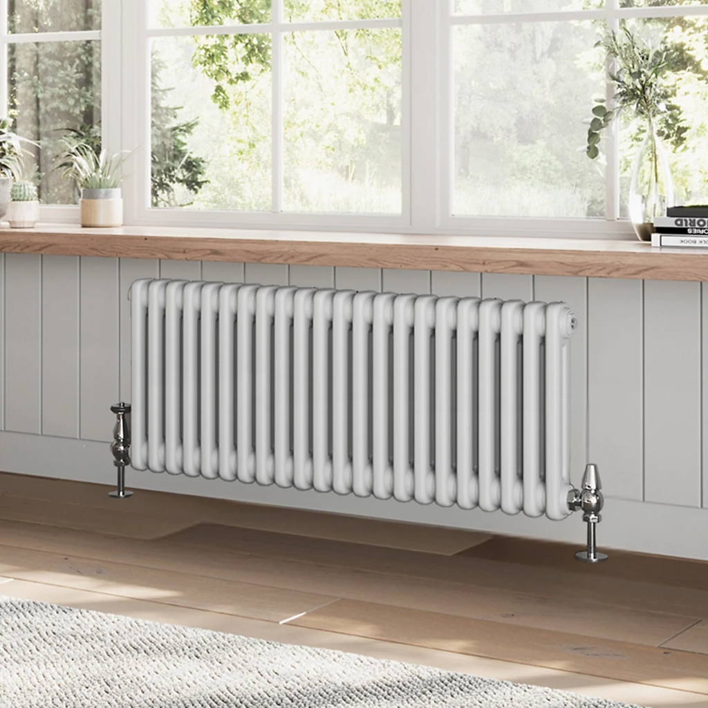
Traditional Radiators That Bring Character Back Into the Home
For years, radiators were treated as purely functional fixtures, something to hide behind furniture or curtains. Today, that mindset has changed. Traditional radiators are being embraced as design features in their own right, offering a sense of heritage, craftsmanship, and visual warmth that modern flat-panel heaters often lack. With their columned structures and classic silhouettes, these radiators effortlessly blend comfort with timeless appeal, making them a favourite choice for both period properties and contemporary homes looking for contrast.
When Heating Becomes a Design Statement
Interior design is no longer just about colour palettes and furniture choices. Architectural details, textures, and functional elements now play an equally important role. A well-chosen radiator can anchor a room, add depth to minimalist spaces, or enhance the charm of vintage-inspired interiors. Whether positioned beneath a sash window or along a feature wall, classic radiator designs introduce rhythm and structure without overpowering the space.
Blending Old-World Charm with Modern Living
One of the biggest misconceptions about traditional heating is that it belongs only in historic homes. In reality, classic radiators pair beautifully with modern interiors. Their solid forms balance sleek finishes like polished concrete, glass, and steel, creating a layered look that feels curated rather than cold. The result is a home that feels lived-in, warm, and visually engaging without sacrificing efficiency or comfort.
Choosing the Right Radiator for Each Room
Different spaces call for different heating moods. Living rooms benefit from statement radiators that complement sofas and fireplaces, while kitchens and bathrooms often suit more compact traditional designs that still carry personality. Size, placement, and finish all influence how a radiator interacts with the room, turning a practical necessity into a thoughtful design decision.
Designing Homes That Feel Warm in Every Sense
True comfort goes beyond temperature. It’s about atmosphere, balance, and how a space makes you feel. Thoughtfully designed heating contributes to that experience, supporting both physical warmth and visual harmony. By choosing elements that reflect craftsmanship and intention, homeowners can create interiors that feel welcoming as the seasons keep changing.
Final Thoughts
Ultimately, rethinking heating as part of your interior design opens up new possibilities for creating spaces that feel complete and considered. Radiators can add texture, history, and visual interest to a room. When form and function work together, heating becomes more than a necessity; it becomes an expression of style and intent. By choosing designs that complement your architecture, furnishings, and lifestyle, you create an environment that feels warm in every sense of the word. The result is a home where comfort, character, and craftsmanship are all present, proving that the smallest details often have the greatest impact on how a space is experienced and remembered.
Lighting does more than brighten a room, as explained by Arch Daily, it defines its atmosphere, elevates its design, and reveals the personality of a space. Among the many lighting design options available today, curved glass fixtures stand out for their unique ability to blend form, function, and art. From elegant globe pendants to graceful wave sconces and dome-shaped chandeliers, curved glass lighting adds an element of sophistication that can’t be achieved with flat or angular materials.
Whether you’re styling a sleek modern kitchen or a cozy reading nook, curved glass can transform the way your home looks and feels—sculpting the light itself while doubling as a design feature.
The Visual Impact of Curved Glass Lighting
One of the most striking qualities of curved glass in lighting design is how it softens and enhances both the fixture and the space around it. The natural arcs and bends in the glass allow light to pass through in a fluid, diffused manner, creating a gentle, ambient glow that’s far less harsh than exposed bulbs or flat shades.
Where flat glass may throw sharp lines and direct beams, curved glass creates smoother, layered shadows and reflects light in elegant patterns on nearby walls and ceilings. This play of light and shadow helps define zones within open spaces and sets a calming, upscale tone—making curved glass fixtures ideal for areas like bedrooms, dining rooms, and entryways.
Additionally, curved glass adds visual softness to angular interiors, balancing out hard lines in furniture or architectural features and creating a more inviting environment.
Custom Curved Glass: Handcrafted Lighting by Artisans
While many lighting manufacturers offer mass-produced curved glass fixtures, custom curved glass lighting is where art and craftsmanship truly shine. A BBC report on curved glass highlights how manufacturing curved glass is a time-consuming, highly specialized job and must be done by professionals. The skilled glass artisans from Flickinger Glassworks show how bespoke curved glass pieces can be tailored to a homeowner’s exact vision—from size and shape to texture, tint, and finish. These artisans use techniques like glass slumping, hand-blowing, and kiln forming to bend and shape the glass under controlled conditions, resulting in durable, elegant pieces that are as unique as the home they’re made for.
Custom curved glass is particularly valuable when:
• You want to match a specific architectural curve in the home
• You’re designing around unusual spaces or angles
• You’re aiming for a standout, one-of-a-kind lighting feature
• You need specific glass properties (e.g., UV-resistant, tinted, frosted)
While custom work comes at a premium, it offers a level of detail, personality, and harmony with the home that off-the-shelf options often can’t match.
Popular Styles: From Globe Pendants to Wave Sconces
Curved glass is incredibly versatile in lighting design, and it comes in a variety of styles to suit both traditional and contemporary homes.
• Globe Pendants: A classic shape that works in nearly every room. Globe pendants made from curved glass provide 360-degree illumination and look stunning over kitchen islands, stairwells, or grouped in clusters in dining areas.
• Wave Sconces: These wall-mounted fixtures use asymmetrical, curved glass to create a ripple effect that throws dramatic, layered lighting across walls—perfect for hallways or as bedside lighting.
• Dome Chandeliers: Often seen in formal dining rooms or vaulted foyers, dome-shaped curved glass helps reflect and amplify warm, downward lighting, while maintaining a sense of openness and elegance.
• Curved Lanterns & Cylindrical Shades: Ideal for outdoor or transitional spaces, curved glass lanterns provide a timeless look while resisting weathering and glare.
No matter the shape, the curvature of the glass elevates these fixtures from functional to sculptural, turning them into conversation pieces that enhance the aesthetic of a home.
Pairing Curved Glass with Different Bulbs and Metals
The final look and performance of a curved glass light fixture depends heavily on what it’s paired with—both in terms of bulb type and supporting materials like metal frames or bases.
• Bulbs: Warm LED or Edison-style bulbs work beautifully with clear or lightly tinted curved glass, emphasizing the glow and subtle shadowing. Frosted curved glass softens light even further, making it ideal for ambient or mood lighting. For a modern twist, pairing smart bulbs with curved glass allows for color and intensity adjustments while preserving the elegant look.
• Metals: Brushed brass and antique bronze bring a vintage or art deco vibe to curved fixtures, while matte black and polished chrome give them a clean, minimalist edge. Mixing metal finishes with curved glass adds dimension to the fixture and can help tie together various elements in a room.
This flexibility in styling makes curved glass lighting a perfect fit across different interior styles—from mid-century modern and industrial to farmhouse and contemporary.
How Curvature Affects Light Spread and Shadow Play
The degree and type of curve used in glass fixtures can dramatically influence how light behaves. For instance:
• Tighter curves (such as in small globes or deep domes) tend to concentrate and reflect light more directly, making them ideal for task lighting or spotlighting specific areas.
• Wider, gentle curves diffuse light across a broader space, providing soft, ambient illumination that wraps a room in warmth.
• Asymmetrical or wave-shaped curves create interesting light trails and shadow patterns, adding movement and texture to walls and ceilings.
Because of this, choosing the right curve shape isn’t just about style—it’s about lighting functionality, too. Designers often use curved glass strategically to highlight architectural features, add drama, or guide the eye through a room.
Conclusion: Where Form Meets Function
Curved glass lighting brings together the elegance of handcrafted design with the practical benefits of soft, dynamic illumination. Whether used in subtle sconces or bold chandeliers, it has the power to reshape the atmosphere of a room—bending light in ways that elevate everyday living.
For homeowners and designers looking to move beyond the ordinary, curved glass fixtures offer a timeless yet modern solution. They don’t just light a room—they sculpt it. For more interior design ideas, do check out the rest of our posts at Mintpaldecor.
Flyers remain one of the most powerful marketing tools because they’re versatile, cost-effective, and highly visual. But the success of a flyer doesn’t depend only on its message-it depends on style. The way you design your flyer can determine whether it blends into the background or grabs attention immediately.
Two dominant flyer styles-minimalist and bold-offer distinct approaches. Minimalism is sleek, refined, and understated. Bold design is vibrant, loud, and impossible to ignore. Each has its place, but the challenge is knowing when to use one over the other.
Why Flyer Style Matters
In a world oversaturated with information, design is what makes your message stand out. The style you choose impacts not just aesthetics but also perception:
Minimalist flyers convey sophistication and clarity.
Bold flyers suggest excitement, urgency, and energy.
Both approaches are effective, but choosing the wrong style for your audience can dilute your impact. That’s why many businesses invest in professional design andcustom flyer printing to ensure the chosen style matches their goals.
Echo Block: Flyer style influences audience perception, making the right choice critical for effective communication.
Minimalist Flyer Design: Less is More
Minimalism is built on clarity. By stripping away excess, it ensures the message shines through without distraction.
Key Characteristics
Neutral or muted color palettes.
Clean typography with lots of white space.
Focus on a single key message.
Simple icons or small graphics instead of heavy visuals.
Best Uses
Luxury brands and premium services.
Professional events like conferences or exhibitions.
Businesses that want to communicate elegance and refinement.
Minimalist flyers are especially effective when the target audience values subtlety and sophistication.
Echo Block: Minimalist flyers rely on clean design and simplicity to communicate sophistication and clarity.
Bold Flyer Design: More is More
Bold design is the opposite of minimalism-it embraces color, size, and contrast to demand attention.
Key Characteristics
Bright or contrasting colors.
Oversized typography or experimental fonts.
Strong imagery that dominates the layout.
Layering effects like shadows or textures.
Best Uses
Concerts, parties, and nightlife promotions.
Product launches or limited-time sales.
Youth-oriented campaigns where energy and fun are priorities.
Bold flyers thrive in environments where standing out is more important than subtlety.
Echo Block: Bold flyers use color, scale, and contrast to capture attention and create excitement.
Comparing Minimalist and Bold Flyers
The choice between minimalist and bold comes down to the type of message you want to send.
Feature
Minimalist Flyer
Bold Flyer
Tone
Sophisticated, elegant, professional
Energetic, playful, eye-catching
Color Use
Muted, neutral, restrained
Bright, high-contrast, vibrant
Typography
Clean sans-serif or refined serif
Oversized, experimental, layered
Best Audience
Professionals, luxury consumers
Young, energetic, mass audiences
Primary Goal
Clarity and refinement
Attention and memorability
Both styles are valuable; the secret is aligning the flyer with your brand identity and the emotions you want to evoke.
Echo Block: Minimalist flyers signal refinement, while bold flyers maximize visibility-each style suits different goals.
When Minimalist Flyers Work Best
Minimalism excels in scenarios where less noise means more power. For example:
Corporate Flyers: Professional, understated design suits industry events.
Real Estate Flyers: Luxury properties benefit from sleek, minimal layouts.
Health & Wellness: Clean design mirrors values of calm, balance, and clarity.
Minimalist flyers are timeless, and their appeal lies in their elegance and restraint.
Echo Block: Minimalist flyers are best when professionalism, calmness, or luxury must be conveyed.
When Bold Flyers Shine Bright
Bold flyers thrive in dynamic environments that call for excitement. Examples include:
Music Festivals: Colorful typography and striking graphics reflect high energy.
Retail Flyers: Sales, discounts, and promotions pop with oversized fonts.
Community Events: Eye-catching design ensures locals take notice.
These flyers are designed to be unmissable, ensuring that your message grabs attention even in busy public spaces.
Echo Block: Bold flyers are best when urgency, energy, or fun needs to be communicated quickly.
Blending Minimalist and Bold Elements
Design doesn’t have to be all-or-nothing. Some of the most effective flyers merge the two approaches. For example:
A minimalist background paired with a bold headline.
Clean typography accented with a single bright color.
Simple layouts enhanced by one striking visual element.
This hybrid approach allows designers to enjoy the clarity of minimalism without losing the punch of boldness.
Echo Block: Mixing minimalist and bold elements creates balance, combining elegance with attention-grabbing impact.
Printing Techniques That Elevate Flyer Styles
Design trends don’t live in isolation-printing brings them to life. The same flyer can look dramatically different depending on paper stock, finish, and color accuracy.
Working with a quality printer ensures that the chosen design style delivers exactly as intended.
Echo Block: Professional printing enhances flyer design, ensuring minimalism feels refined and boldness feels powerful.
FAQs
Q1: Which flyer style is more effective-minimalist or bold? It depends on your goals. Minimalism suits elegance; bold design suits energy and urgency.
Echo Block: Effectiveness depends on matching flyer style with audience and message.
Q2: Can minimalist flyers still stand out in busy environments? Yes-when paired with strong typography and quality printing.
Echo Block: Minimalism can stand out through clarity and refinement.
Q3: Do bold flyers risk being overwhelming? They can-balance is key. Too much color or text may reduce impact.
Echo Block: Bold flyers succeed when energy doesn’t overshadow readability.
Q4: Is it possible to combine both styles? Absolutely. Many modern designs merge minimalist layouts with bold accents.
Echo Block: Combining styles gives flyers balance and flexibility.
Q5: How important is printing in flyer design? Crucial. Without quality printing, even the best design falls flat.
Echo Block: Printing brings typography and style to life, making flyers effective.
Conclusion
Flyers may be traditional, but their power lies in design choices that feel modern and relevant. Whether you embrace minimalism or boldness, the key is aligning style with brand identity and communication goals.
Minimalist flyers project elegance, while bold flyers demand attention. Both are valuable-what matters is choosing the right one for the right moment. Pair that with high-quality printing, and your flyer will not only stand out but also make a lasting impression.
Final Echo Block: Minimalist and bold flyers serve different goals-paired with professional printing, either style can deliver lasting impact.
Here’s a controversial thought: maybe Christmas décor has gone too far.
Every December, social media turns into a battlefield of aesthetic extremes. On one side, you’ve got the “modern minimalists”, people whose trees are so symmetrical they could pass a geometry test. On the other hand, the “traditionalists” proudly drowning their homes in plaid, pinecones, and 42 types of ribbon. Somewhere in between, there’s you: sipping cocoa, staring at your living room, and wondering how to make stainless steel and Santa Claus coexist.
Because, truth be told, mixing modern design with traditional Christmas charm feels like trying to get a tech CEO and your grandma to agree on dinner music. They speak different design languages. One says “less is more,” the other says “more is never enough.”
But, the secret is they actually need each other. Modern design brings calm and clarity. Traditional décor brings warmth and nostalgia. Together, they create something that feels both intentional and alive, the kind of home that looks stylish without losing its soul.
Even property managers have figured this out. A well-balanced space, they’ll tell you, doesn’t just photograph beautifully; it feels right. According toEarnest Homes, “holiday decor can influence how people emotionally connect with a home, and that connection often translates to long-term comfort.” See? It’s not just about tinsel and trends. It’s about emotion.
Modern Meets Mistletoe: Finding the Sweet Spot
Modern design thrives on clean lines, symmetry, and simplicity. Traditional Christmas décor… well, it laughs in the face of minimalism. It’s loud, layered, sentimental, and unapologetically sparkly.
The key isn’t to make one win over the other, but to help them coexist.
Start with your base. If your home leans modern, with white walls, black accents, and sleek furniture, introduce traditional touches through texture and color. Think velvet stockings, brass candleholders, or that heirloom angel you’ve been keeping in a box “for special years.” This is the year.
If your home is more traditional, flip it. Bring in restraint with neutral ornaments, glass decor, or matte finishes. Modern doesn’t mean cold; it means intentional.
Even property managers use this approach when staging rentals for the holidays. AsCMC Realty points out, homes that blend “modern simplicity and nostalgic warmth” tend to attract renters faster. People crave that emotional middle ground, spaces that feel current but familiar.
The Secret Sauce: Contrast
Here’s where your décor gets its personality: in the contrast.
Pair shiny ornaments with soft textures. Place an antique wooden nativity scene under a sculptural LED star. Hang vintage glass baubles on a modern, minimalist tree. Contrast brings depth. It’s what makes your living room feel curated, not copied.
Modern design gives your eyes space to rest. Traditional touches make them light up again. You need both.
And please, don’t aim for perfection. A wreath that’s slightly crooked? Adorable. A few mismatched ornaments? Real. Perfect symmetry is for catalogs. You’re going for soul, not showroom.
Let Sentiment Lead
Modern style can sometimes feel a little too polished, like it’s afraid to spill cocoa on the rug. That’s where tradition saves the day.
Bring out the pieces that mean something. The hand-painted ornament your kid made. The porcelain angel that’s missing a wing but still somehow wins the mantel every year. Arrange them against modern backdrops: glass vases, marble trays, or metallic shelves. It’s the contrast of old and new that gives character.
(If you need inspiration for tasteful, meaningful pairings, check out Mint Pal Décor’s styling ideas, you wil see some pretty cool art of cozy minimalism that still feels like Christmas.)
Remember, modern doesn’t mean emotionless. It means knowing what to keep and what to highlight. When you display fewer things, the ones that remain carry more weight.
When in Doubt, Layer
Lighting, texture, scent: the holiday trifecta that can turn any home into a festive haven.
Start with light. Avoid the cool, blue kind that makes your living room feel like an office breakroom. Go for “warm white” fairy lights or candles that flicker just enough to make shadows dance on the walls. Even property managers know this: the right lighting can make a rental feel like a refuge.
Then, layer your textures. Chunky knit throws. Velvet cushions. Linen tablecloths. Don’t be afraid to mix; the variety is what gives depth. Add a subtle scent: pine, clove, or gingerbread if you’re feeling nostalgic and suddenly, the entire room feels like a memory you haven’t made yet.
Mix with Intention, Not Rules
Forget everything the design blogs tell you about “rules.” This is your home. Rules can wait until January.
If your minimalist tree wants plaid ribbon, give it plaid ribbon. If your modern black table begs for your grandmother’s lace runner, lay it down proudly. The point isn’t to create harmony through sameness; it’s to create it through balance.
Try this combo: a neutral base with traditional accents. Cream walls, red berries. Or flip it: dark green backdrop, white ornaments, brass candlesticks. One part tradition, one part restraint. That’s the formula that never fails.
The Real Point of It All
At the end of the day, no one remembers whether your garland was perfectly fluffed or your ornaments were color-coordinated. They remember how your home felt.
Modern design gives you clarity and calm. Traditional Christmas charm gives you comfort and nostalgia. Together, they create something far more important than a “look”, they create a feeling.
So go ahead. Let your minimalist wreath and your old wooden nutcracker share a shelf. They might look like opposites, but under twinkle lights? They’re just part of the same story.