
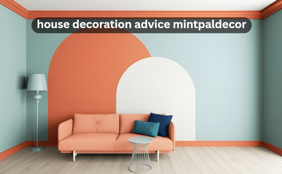
Most home decoration guides focus on what to add. More furniture. More art. More plants. What they skip is the reason rooms feel off even after all that effort — usually, it is not a shortage of things but a mismatch in how light, proportion, and texture interact. House decoration advice takes a different position: before buying anything new, understand what your existing space is actually doing wrong. This guide covers six targeted strategies drawn from mintpaldecor that address the real culprits behind dull interiors — dead corner zones, single-layer lighting, ignored doorways, and more. Whether you are decorating a new home in Dallas or refreshing a studio apartment in Chicago, these approaches apply across budgets and room sizes. By the end, you will have a clearer picture of how to make rooms feel intentional rather than assembled. No complete overhauls needed. Each tip is a specific fix you can act on this weekend.
1. Fix Dead Corner Zones Before Buying Anything New

Most rooms have at least one corner that collects dust but contributes nothing. Decorators call these dead zones, and they are the fastest sign that a space was furnished without a plan. House decoration advice addresses this upfront because ignoring corners is what makes a thoughtfully furnished room still feel incomplete.
A floor lamp with a readable arc is the most efficient fix — it fills vertical space, creates a warm light source, and costs far less than a side table and sculpture combo. For smaller corners, a tall indoor plant with a narrow footprint (fiddle leaf figs, snake plants, tall dracaenas) does the same job with added freshness. The goal is vertical presence, not surface clutter.
| Room | Problem | Best Fix | Budget Range |
| Living Room | Empty back corner | Arc floor lamp + low side table | $60–$180 |
| Bedroom | Unused corner beside bed | Tall potted plant or reading chair | $30–$250 |
| Dining Room | Corner without function | Bar cart or open shelving unit | $80–$300 |
| Home Office | Blind corner behind desk | Floating shelves with books + a plant | $40–$150 |
| Entryway | Tight corner at door | Narrow console table or umbrella stand | $50–$200 |
2. Layer Light Across Three Levels — Not Just Overhead
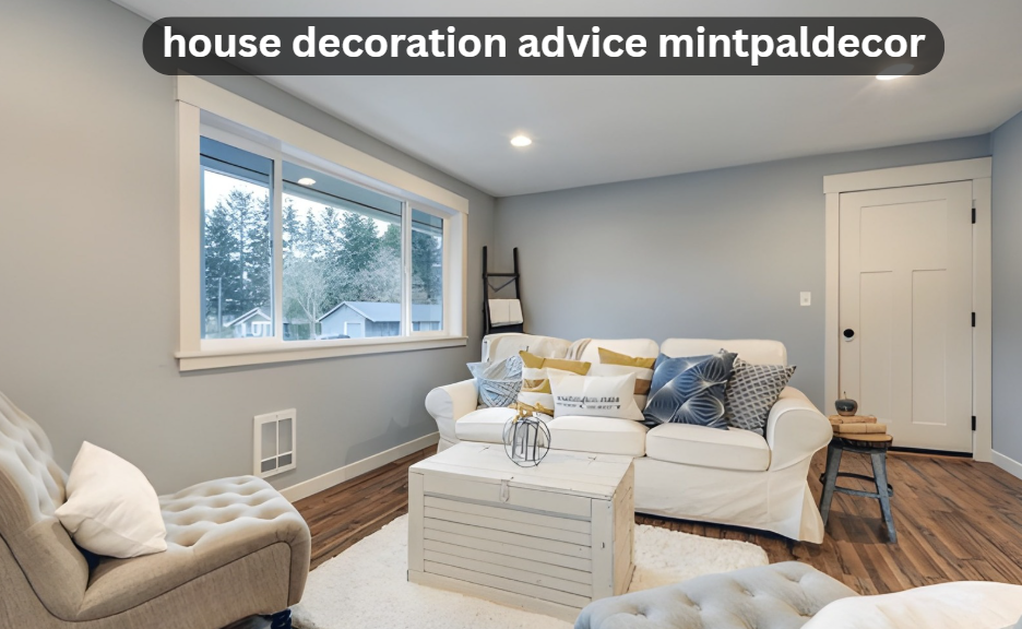
Single-source overhead lighting is the most common design mistake in American homes. It flattens a room visually and strips it of warmth regardless of how well everything else is decorated. The fix is straightforward: introduce three levels of light — ambient (ceiling), task (reading, cooking), and accent (art, shelves, corners).
For ambient light, dimmers are a $15 upgrade that changes a room entirely. For task light, a directional reading lamp beside a sofa is more useful than a ceiling spot. For accent light, plug-in puck lights under floating shelves or a small LED strip inside a bookcase add depth you cannot get from above. No rewiring required for most of these. A room with three light sources at different heights reads as designed; a room with one overhead fixture reads as unfinished.
3. Apply the House Decoration Advice Rule on Statement Pieces
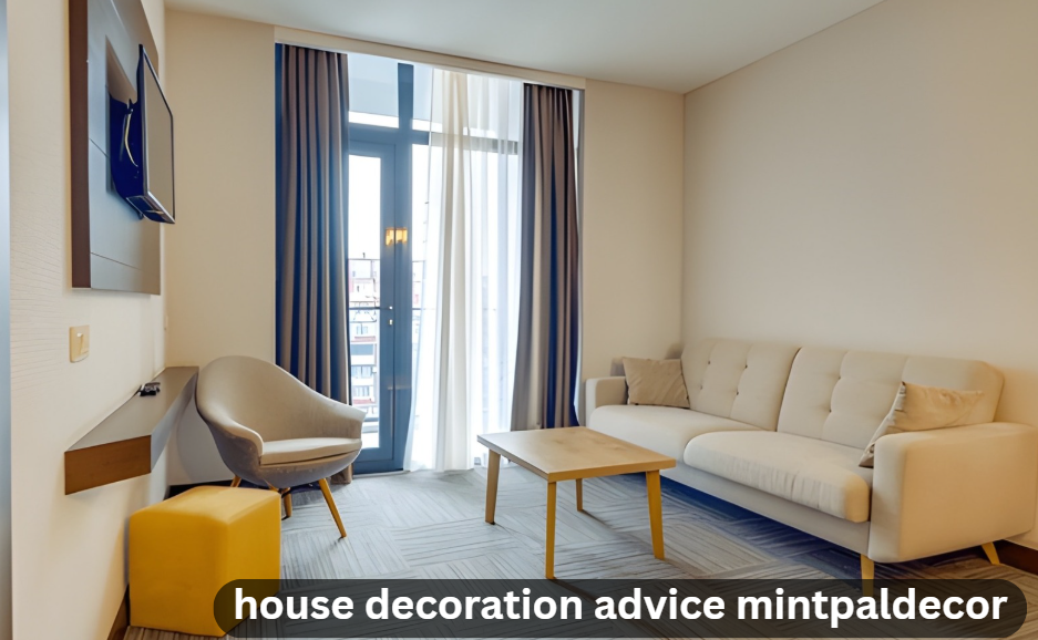
One dramatic element per room. That is the rule, and it is harder to follow than it sounds. Most people who buy a bold rug then add a colorful gallery wall, then bring in a sculptural coffee table. What was a statement becomes noise. House decoration advice is specific about this: pick one, then make everything else quiet enough to let it breathe.
The statement piece does not have to be expensive. An oversized vintage mirror from an estate sale can work as well as a $2,000 statement sofa. What matters is scale and singularity. The piece should be large enough to register from the doorway and distinctive enough that a visitor’s eye goes to it first. Once you have that anchor, the rest of the room is just supporting it — neutral walls, low-key furniture, restrained accessories.
4. Pay Attention to What Interior Doors Are Doing to Your Space

Interior doors are probably the most ignored element in home decoration. People will spend hours on cushion color and ignore the fact that their builder-grade hollow doors with gold lever handles are actively working against the aesthetic they are trying to build. Understanding interior doors is useful here because the door choices that resonate most with design-forward US homes in 2026 are not expensive replacements — they are low-cost treatments.
Black matte hardware swaps cost under $25 per door and immediately modernize any handle set. For doors themselves, black-framed glass panel doors are leading trends for open-plan homes because they separate spaces while keeping light flowing. Arched openings with a natural wood finish are popular in more traditional or warm-contemporary interiors. If replacement is not in the budget, painting existing doors in a deep, saturated color (navy, forest green, charcoal) against a neutral wall creates an intentional contrast that reads as deliberate design rather than a budget workaround.
5. Use Texture as the Primary Design Variable, Not Color
Color gets most of the attention in decoration guides, but texture does more of the actual work. A monochrome room — entirely white or entirely beige — reads as rich when it layers linen throws, wool rugs, raw wood, polished brass, and matte ceramics together. The same room with one texture throughout feels flat regardless of color choice. This is why home improvement content consistently returns to material contrast as a foundational principle.
A practical starting point: scan your main living area and count how many distinct materials are present at eye level. If the answer is fewer than four, the room needs texture before it needs new color. Woven baskets, a jute rug, a velvet throw, ceramic table lamps, and an unfinished wood tray can cover the gap for under $100 total and change how the entire space reads in photos and in person.
| Base Material | Pairs Well With | Avoid Pairing With | Effect |
| Raw wood | Polished metal, linen, stone | Plastic, glossy acrylic | Warm, grounded, organic |
| Velvet upholstery | Matte ceramic, jute, marble | Faux fur, shiny satin | Luxurious without looking overdone |
| Concrete or plaster | Soft wool, warm brass, plants | Stainless steel, hard plastic | Modern with warmth |
| Wicker or rattan | Cotton, natural stone, wood | Mirrored furniture, chrome | Casual, coastal, relaxed |
| Marble | Linen, matte black, dark wood | Too many other glossy materials | Elegant, timeless |
6. House Decoration Advice on Connecting Rooms Visually
Rooms that feel disconnected from each other are a common problem in US homes, particularly in open-plan layouts or older homes where every room was treated as a separate design exercise. Our decoration advice suggests a simple thread strategy: repeat one material, one color, or one shape across adjacent rooms to tie them together without making them identical. This could be the same natural wood tone in both the living room and dining area, or the same shade of warm white on trim throughout the home.
The connecting element does not need to be prominent — it just has to be present. A brass finish in the kitchen light fixture echoed in the bedroom lamp. A terracotta pot in the entryway matching a similar hue in the living room cushion. These small echoes are what designers use to make homes feel cohesive when photographed from hallways or open doorways. Explore more through home hacks for extended visual cohesion strategies across whole-home design.
Frequently Asked Questions
What is the best house decoration advice?
The best house decoration advice offers centers on fixing dead corner zones first, layering light across three levels, and choosing one bold statement piece per room rather than scattering multiple decorative items across a space.
How do you start decorating a home from scratch?
Start with a neutral wall base in white, warm beige, or soft gray. Then establish your light sources before buying any furniture. Once light and walls are set, bring in one statement piece and build the rest of the room around it. This sequence prevents the most common overspending mistakes.
Does texture matter more than color in home decor?
Yes, texture often has more visual impact than color. A room with a single neutral palette but layered textures — linen, wool, raw wood, polished metal — reads as rich and intentional. A colorful room with flat, single-material surfaces tends to feel flat regardless of the palette chosen.