What Your Walls Say Before You Even Speak 

picture hanging

Walls are among the most overlooked communication tools in any home. Long before a  guest sits down, before a conversation starts, the surfaces surrounding them have already  delivered a message. Whether intentional or not, how a space is arranged — and what goes  on its walls — shapes how people feel about the moment they walk in. 

This is not a matter of taste alone. Psychology researchers studying environmental cues  have consistently found that visual stimuli in a room influence mood, perceived warmth,  and even how comfortable someone feels staying in a space. A well-arranged wall signal of  care and intention. A bare or cluttered wall signals something else entirely. 

The Psychology of Arranged Spaces 

Interior environments affect behavior in measurable ways. Studies in environmental  psychology point to the concept of “place attachment” — the emotional bond people form  with spaces that feel personal and curated. Rooms with meaningful objects, deliberate  layout, and visual cohesion tend to produce a stronger sense of belonging for both  residents and visitors. 

This is why what gets hung on a wall, and how, carries more weight than most homeowners  assume. A collection of framed photographs arranged thoughtfully along a hallway does  more than fill empty space — it tells a story. It communicates history, personality, and  stability. 

Why Arrangement Matters as Much as Selection 

Choosing what to display is only half the equation. The arrangement — spacing, alignment,  height, and grouping — determines whether a wall reads as intentional or accidental.  Gallery walls that feel curated follow consistent logic: similar frame widths, coordinated  color tones, or a shared visual theme. Without structure, even beautiful individual pieces  can feel chaotic together. 

This is where the mechanics of hanging come in. Consistent spacing between frames, level  alignment, and secure mounting are the foundation of a finished look. Many people  underestimate how much uneven spacing or slightly tilted frames undercut an otherwise well-chosen display. Using picture hanging kits that include the right hardware for different  wall types and frame weights takes the guesswork out of execution, allowing the  arrangement to look as considered as it was intended to be. 

Walls as a Reflection of Priorities

Beyond aesthetics, wall displays communicate values. Homes where children’s artwork is  prominently framed — rather than stuck to a refrigerator — signal that creative expression  is celebrated. Homes with travel photographs on display hint at curiosity and experience.  

Walls that feature only mass-produced prints without any personal element tend to feel  transactional, like a hotel lobby rather than a lived-in home. 

None of these requires significant investment. A deliberate approach to what gets  displayed, and how it is arranged, has far more impact than expensive artwork alone. A  single framed print placed at the correct height on an otherwise empty wall often reads better than five pieces hung carelessly. 

The Functional Side of Wall Display 

Walls in a home also carry practical roles beyond decoration. Entryway hooks, shelving  systems, and framed mirrors all serve functional purposes while contributing to the overall  visual impression. In smaller homes, vertical surfaces are among the few remaining areas  that can be organized without consuming floor space. 

When wall systems are thoughtfully integrated — storage that doubles as visual interest,  mirrors that expand perceived space, art that reinforces a room’s color palette — the result  is a home that feels cohesive rather than compartmentalized. 

Getting the Details Right 

The details that most people dismiss are often what separate a space that feels finished  from one that does not. This includes the height at which art is hung (eye level, typically  around 57 to 60 inches from the floor to the center of the piece, is the gallery standard), the  relationship between frame size and wall scale, and the weight distribution across a wall  surface. 

Walls with a single small frame in the center of a large expanse tend to feel timid. Walls  that are overfilled lose visual breathing room. The ideal falls somewhere between — enough to hold attention, deliberate enough to reward it. 

Creating a Space Worth Walking Into 

The walls of a home are among the most permanent-seeming and least frequently  reconsidered surfaces in daily life. Furniture gets rearranged. Floors get new rugs. But  walls often stay exactly as they were set up on move-in day or accumulate pieces over time  without a governing plan. 

Taking a more intentional approach — deciding what a wall should communicate,  choosing pieces that serve that purpose, and executing the arrangement with care —

transforms a passive background into an active part of how a home feels. That impression,  formed within seconds of entering a room, is one of the most lasting ones a space creates.

Why 2026 Is the “Golden Year” to Invest in Property in Punta Cana

Real Estate

There’s a particular kind of electricity in the air in Punta Cana, Dominican Republic, when a market is about to shift. When the locals sense it, the early investors feel it, and the numbers begin to confirm what the streets have been whispering for months. 

Actually, Punta Cana is tucked along the eastern coast of the Dominican Republic. This sun-drenched stretch of coastline has quietly transformed from a tourist playground into one of the Caribbean’s most compelling real estate places. 

In 2026, the combination of surging tourism, aggressive infrastructure expansion, investor-friendly tax laws, and a new wave of remote workers choosing island life over city grind has created a window that serious investors are watching very closely.

Why Punta Cana’s Real Estate Market Is Entering a New Growth Phase

Every real estate market has inflection points. Moments where multiple forces converge at once and push values into a completely new trajectory. Punta Cana is sitting at one of those moments right now, and the people paying attention are already moving.

Tourism Numbers Are Reaching Record Highs

The Dominican Republic welcomed over 11.6 million visitors in recent years, with Punta Cana absorbing the lion’s share. In 2025 and into 2026, those numbers haven’t retreated. They’ve climbed. Direct flight routes from Europe, Canada, and the United States continue to expand, and Punta Cana International Airport remains one of the busiest entry points in the entire Caribbean basin.

What that means on the ground is simple: More tourists mean relentless short-term rental demand, higher hospitality capital flowing into the region, and ultimately, accelerating property valuations across the board. The pipeline of visitors isn’t slowing down, and the real estate market is reflecting that reality.

International Buyers Are Expanding Beyond Vacation Homes

What’s changed most noticeably in 2026 is who is actually buying. It’s no longer just the retiree looking for a winter escape or the couple purchasing a dream vacation home. 

Today’s buyers include digital nomads setting up permanent bases, Latin American investors diversifying away from volatile home currencies, and North American buyers who’ve been priced out of Florida and coastal Mexico and discovered that the Dominican Republic offers a genuinely comparable lifestyle at a fraction of the cost.

That shift matters. The buyer pool has deepened significantly, and that kind of diversity is exactly what stabilizes a market and gives it staying power through different economic cycles.

The CONFOTUR Tax Incentive

While lifestyle and numbers draw investors in, the Dominican Republic’s aggressive tax incentives seal the deal. The country’s landmark CONFOTUR Law (Law 158-01) is designed specifically to fast-track tourism development by keeping investor overhead remarkably low.

For approved holiday developments, this law grants buyers:

  • A 100% exemption from the standard 3% property transfer tax.
  • A 100% exemption from the 1% annual luxury Real Estate Tax (IPI) for up to 15 years.

When you erase property taxes and transfer fees from your balance sheet for a decade and a half, your net ROI and cash flow potential instantly outpace almost every other market in the Americas.

Infrastructure Projects Are Increasing Property Value Potential

The Dominican government has made infrastructure a clear national priority, and you can see it happening in real time. New highways connecting Punta Cana to Santo Domingo are cutting travel times and opening up development corridors that simply weren’t viable before. 

Hospital expansions, upgraded utilities across tourist zones, and the ongoing buildout of Cap Cana’s marina and commercial district are all lifting property values in surrounding areas. When a government puts this level of capital into a region, the land around it doesn’t stay cheap for long. 

Best Areas to Buy Property in Punta Cana

Location in Punta Cana isn’t just about the view; it determines your rental occupancy rate, your appreciation curve, and your day-to-day lifestyle. Understanding the distinct character of each zone is essential before making any commitment.

Bávaro for High Rental Demand

Bávaro is the engine of Punta Cana’s tourism economy. With its famous white-sand beaches, dense hotel corridor, and bustling commercial strip, this area generates some of the highest short-term rental yields in the region. 

For investors whose primary goal is cash flow, Bávaro delivers consistent occupancy rates year-round. And the demand shows no sign of softening.

Cap Cana for Luxury and Long-Term Appreciation

If Bávaro is the heartbeat, Cap Cana is the prestige address. A masterplanned private community covering over 30 square miles, Cap Cana is where luxury villas sit alongside championship golf courses, a deep-water marina, and high-end restaurants. 

Properties here appreciate steadily rather than rapidly, making it ideal for buyers thinking in decades rather than quarters.

Downtown Punta Cana for Affordable Entry Points

For investors who want exposure to the market without a heavy upfront commitment, the downtown corridor offers more accessible price points. 

As the area continues to develop commercially, early buyers here stand to benefit from both rental income and appreciation as infrastructure catches up.

Uvero Alto for Emerging Investment Opportunities

Uvero Alto sits north of Bávaro and remains relatively undiscovered, which is precisely what makes it interesting. With pristine beaches, lower land costs, and early-stage development beginning to accelerate, this is the zone for investors with a longer horizon and a higher risk appetite. Think of it as Bávaro ten years ago.

When evaluating the best areas to buy property in Punta Cana, your strategy should dictate your geography, not the other way around.

Why 2026 Could Offer Better Returns Than Waiting Until 2027

In real estate, patience and hesitation look identical until the results come in. The investors who entered the Riviera Maya market in the early 2010s didn’t do so because the fundamentals were perfect. They did so because the fundamentals were becoming perfect, and they moved before the crowd arrived.

Punta Cana today mirrors that setup. Property prices here are still meaningfully lower than comparable Caribbean destinations like the Cayman Islands, Turks and Caicos, or even parts of Costa Rica. 

The premium beachfront and marina-adjacent inventory, the kind that generates the strongest rental yields and the most reliable appreciation. Waiting until 2027 means paying 2027 prices for assets that are being built and valued at 2026 levels right now.

What Foreign Investors Should Look for Before Buying

Enthusiasm without diligence is just gambling. The good news is that the Dominican Republic has a well-established legal framework for foreigners to get property in Punta Cana. Foreigners have the same rights as nationals when it comes to buying and owning real estate. But like any market, the details matter enormously.

Understanding HOA and Maintenance Costs

Gated communities and resort-style developments come with HOA structures that vary widely in what they include and what they cost. 

Before signing, buyers should request full breakdowns of monthly fees, what’s covered, the history of fee increases, and the financial health of the HOA itself.

Evaluating Vacation Rental Potential

Not every beautifully designed condo generates high rental income. Proximity to the beach, in-building amenities, air conditioning quality, and whether the development allows short-term rentals through platforms like Airbnb and Vrbo all factor into a property’s actual earning potential. Run real occupancy numbers, not the developer’s best-case projections.

Working With Trusted Local Real Estate Professionals

The single most important decision a foreign buyer makes in this market is who they work with. A reputable local partner navigates developer relationships, legal title verification, and neighborhood dynamics in ways that no amount of online research can replicate. 

Platforms like Roof360 for buying a condo in Punta Cana have built their reputation on guiding international buyers through exactly this process, combining market knowledge with on-the-ground access to vetted developments across the region.

Conclusion

The Dominican Republic has a phrase that captures how locals feel about their island: “Quisqueya la bella”, beautiful Quisqueya, the ancient Taíno name for the land. There’s a quiet pride in the place, an understanding that what they have is genuinely rare, and a growing recognition that the rest of the world is beginning to see it too.

2026 is not just another standard calendar year in Punta Cana’s growth story. It is the defining moment where infrastructure has matured, global demand has deepened, and premium assets are still within reach before the next major valuation leap.

For buyers looking to capture both immediate cash flow and generational wealth, acquiring property in Punta Cana right now offers a rare convergence of tax benefits, high rental yields, and robust market stability. The investors who look back at this moment a decade from now will likely see it as the exact window they either boldly stepped through or watched slip away from a distance.

6 Advancements Immersive Experience KDArchitects Driving the Next Era of Design

Architecture used to be something you experienced only after it was built. You walked in, looked around, and formed an opinion. Today that has changed. The advancements immersive experience KDArchitects has introduced allow clients to walk through a building before a single foundation is poured. Across the United States, firms that once relied on printed drawings and physical models are now presenting fully navigable virtual environments. KDArchitects sits at the center of that shift. This guide covers six specific advancements and what each one means for designers, clients, and communities.

What Makes Immersive Architecture Different

advancements immersive experience kdarchitects

Most design tools show you what a building looks like. Immersive tools show you what it feels like. A floor plan can look perfectly logical and still produce a space that feels cramped or disconnected. Immersive technology catches those problems early when changes cost very little. The advancements immersive experience kdarchitects has built into their process are grounded in one idea: people should understand what they are approving before they approve it. Every project the firm takes on carries a strong visual identity, and kdarchistyle reflects how KDArchitects keeps their design language consistent across every building type.

1. Virtual Reality Walkthroughs

advancements immersive experience kdarchitects

VR is the most visible of the advancements immersive experience KDArchitects has brought to design. Clients put on a headset and walk through a building that does not yet exist. They move from room to room, check ceiling heights, stand at windows, and feel how spaces connect. What looks spacious on a floor plan sometimes feels tight at human scale. VR reveals that before construction, not after. Design teams also use VR together to catch coordination problems before they become expensive on site. The range of work the firm produces across different building categories is well documented at kdarchistyle architecture styles by kdarchitects  showing how VR supports design decisions across very different project types.

2. Augmented Reality On Site

advancements immersive experience kdarchitects

AR brings the design directly to the building site. Through a tablet or AR glasses, a contractor on an empty lot can see exactly where a structure will sit and how shadows fall at different times of day. A homeowner renovating a kitchen can see new cabinets in their actual space before any work begins. In dense US cities where zoning constraints demand precision, AR gives architects and clients a contextual understanding that no rendering can match. Workers referencing a live digital model on site make fewer errors, which reduces rework and shortens timelines. The firm’s commitment to responsible building is something sustainable and innovative kdarchitects explores in depth.

3. Advancements Immersive Experience KDArchitects Made Through Mixed Reality

advancements immersive experience kdarchitects

Mixed reality places digital models inside real physical rooms so teams can interact with them together. One person in one city and another across the country can stand inside the same virtual space and discuss changes in real time. KDArchitects uses this for client presentations where clients interact with a model that feels present in the room rather than watching a slide deck. They can walk around it and step inside it on the spot. That removes the interpretation gap that comes with traditional presentations. Outdoor environments are part of that same conversation, and kdarchitects landscape ideas by roger morph shows how thoughtful outdoor design connects with the broader architectural vision KDArchitects brings to every project.

4. Real-Time Collaboration Across Teams and Cities

advancements immersive experience kdarchitects

Construction projects fall apart quietly. Not in dramatic moments but in small miscommunications between an architect in one city, a contractor on site somewhere else, and a client who approved something three months ago and has since changed their mind.

KDArchitects addressed this directly. The advancements immersive experience kdarchitects built into its collaboration process let every person involved in a project work inside the same live model, regardless of where they are sitting. An architect in New York and a structural engineer in Chicago can walk through the same space together, flag the same problem, and resolve it in one conversation rather than three weeks of email threads.

For clients, this changes what approval actually means. Instead of signing off on a document they only partially understood, they are walking through a space with their architect present, asking questions and getting answers in real time. That is a fundamentally different level of clarity than a PDF ever provided.

The practical result shows up in budgets and timelines. Errors caught during design cost a fraction of errors caught during construction. Teams that communicate inside a shared model instead of across disconnected files make fewer mistakes. For homeowners thinking about interior choices that need to align with the overall design, interior styling tips offer practical guidance that connects those decisions back to what the architectural intent actually was.

5. Sensory Design

advancements immersive experience kdarchitects

Buildings are experienced with the whole body, not just the eyes. KDArchitects integrates acoustic simulation, material texture tools, and environmental controls into their immersive process. A client reviewing a home theater in VR can hear how the acoustics will perform. Someone reviewing an open office gets a sense of ambient noise before signing a lease. A restaurant that sounds too loud loses guests. A hotel lobby that feels too bright affects mood from the first moment. Sensory tools let those decisions be made intentionally. Home styling plays a direct role in how a finished space is perceived, and sensory design at the architectural level sets the foundation that good space styling then builds on.

6. Advancements Immersive Experience KDArchitects Applied to Sustainable Design

advancements immersive experience kdarchitects

Sustainability decisions are easier to make when you can see their impact. KDArchitects integrates energy performance modeling into the immersive design environment. Architects walk through a VR model while viewing an energy overlay showing heat gain and loss. Clients see in plain terms how a design choice affects energy costs years from now. Daylight simulation, ventilation testing, and thermal analysis are all part of the process. When clients can see the real difference between high-performance glazing and standard windows, they make better choices. For those looking to bring that same intention to interior finishes, mintpaldecor offers guidance that complements the sustainable design philosophy KDArchitects applies at the architectural scale.

Why This Matters for US Clients

advancements immersive experience kdarchitects

The advancements immersive experience KDArchitects has developed address problems that have always made the design process harder. Clients struggle to understand what they are approving. Teams deal with coordination failures that surface too late. Immersive tools close those gaps for everyone involved, from the homeowner to the city planner.

Final Thought

Technology does not make a great architect. But it makes the work more honest. When clients can truly see what they are getting and teams catch problems early, the whole process improves. The advancements in immersive experience KDArchitects has brought to modern design are about closing the gap between what an architect imagines and what a client actually experiences. That gap has caused misunderstandings and budget overruns for decades in the US construction industry. These tools narrow it. For anyone planning a build or renovation, working with a firm that has genuinely invested in immersive technology is simply a smarter way to build.

The Newlywed’s Guide to Furnishing Your First Home Together

Moving into your first home as a married couple is one of life’s most exciting milestones. From choosing the right colour palette to hunting down the perfect sofas in a Perth store, the process of furnishing a shared space is as meaningful as it is fun. But without a plan, it can quickly become overwhelming. This guide walks newlyweds through everything they need to know to create a beautiful, functional home without the stress.

Start With a Shared Vision

Before purchasing a single piece of furniture, sit down together and talk about style preferences. Does one partner lean towards minimalist Scandi design while the other loves warm, rustic tones? Finding a middle ground early prevents costly regrets later. Create a shared mood board to pin rooms, colour schemes, and furniture pieces that appeal to both of you. 

Set a Realistic Budget

Money conversations are not always easy, but agreeing on a furnishing budget before hitting the shops can save a lot of stress. Break the budget down by room, prioritising the spaces used most, typically the living room and bedroom. 

A helpful tip: Allocate roughly 30–40% of the total budget to the living room, since it tends to be the most expensive to furnish properly. Consider setting aside a 10–15% buffer for unexpected costs like delivery fees, assembly charges, or last-minute accessories.

Define Your Shared Style

Blending two people’s tastes into one cohesive aesthetic takes communication. Start by browsing home decor platforms together, saving images that resonate with both of you.

Common styles that suit modern homes include:

  • Coastal/Hamptons: Light timbers, white tones, and natural textures.
  • Scandi minimalism: Clean lines, neutral palettes, and functional pieces.
  • Warm contemporary: Earthy tones, mixed materials, and statement furniture.
  • Boho eclectic: Layered textures, bold prints, and collected pieces over time.

Once a shared direction is identified, shopping becomes far more focused and decisive.

Prioritise the Living Room 

The living room is where couples spend the most time together, entertain guests, and unwind after long days. Getting it right matters.

The sofa is the anchor piece of the space. Choose one that suits both lifestyle and the scale of the room. A generous L-shaped sofa works well for open-plan layouts, while a classic three-seater suits smaller spaces. Look for durable, stain-resistant fabrics if pets or children are on the horizon.

Pairing the sofa with the right coffee table is equally important. From solid timber to glass-topped designs and rattan alternatives, a well-chosen coffee table balances the proportions of the sofa while adding visual interest to the room. Round tables work particularly well in smaller living rooms because they eliminate sharp corners and improve traffic flow.

Complete the living room with a media unit, side tables, and adequate lighting to create warmth and versatility.

Don’t Neglect the Bedroom 

The bedroom should feel like a retreat. Invest in a quality bed frame and mattress first (this is not the area to cut corners). Once the foundation is set, layer in bedside tables, a dresser, and soft furnishings that reflect the shared style.

Matching bedside tables create symmetry, while a statement bedhead adds personality without requiring a full renovation.

Focus on Long-Term Comfort and Functionality 

It’s tempting to fill every room immediately, but living in a space for a few weeks before purchasing everything allows a much better feel for what’s actually needed. Avoid impulse buys that clutter a room without adding real value.

Choose classic, timeless pieces over fast-furniture trends. Quality items that last for years are far more cost-effective and environmentally responsible than replacing cheaper items every few years. 

Add Personality With Soft Furnishings

Once the big-ticket items are in place, soft furnishings are where personality really shines. Cushions, throws, floor rugs, curtains, and artwork breathe life into a space and make it feel like a true home rather than a showroom.

A well-chosen rug can define zones in an open-plan living area and add warmth underfoot. Layer textures wherever possible: linen cushions on a velvet sofa, a jute rug under a timber coffee table, or sheer curtains paired with blockout blinds.

Frequently Asked Questions

How long does it take to fully furnish a first home?

Most homes take several months to a year to feel complete. Many couples furnish in phases based on budget and priorities.

How can different design tastes be combined?

A neutral base palette paired with mixed textures and selective accent pieces helps merge different styles smoothly.

Is it better to buy furniture all at once or gradually?

Gradual furnishing is often more practical, allowing time to understand space needs and personal preferences.

How can budgeting disagreements be avoided?

Setting a shared budget early and dividing spending into categories helps keep expectations aligned and transparent.

What is the biggest mistake when furnishing a first home?

Rushing purchases without a plan is the most common mistake. This often leads to mismatched styles, poor use of space, and unnecessary spending on items that do not suit long-term needs.

10 Iconic KDarchistyle Architecture Styles by KDArchitects That Define Contemporary Living

Most people do not think much about architecture until they walk into a space that just feels right. The light hits well. The rooms connect naturally. Nothing feels out of place. That experience is not accidental. It is the result of decisions made long before the walls went up.

KDarchistyle architecture styles by kdarchitects grew out of exactly that kind of thinking. The people behind this platform believe a building should work for whoever lives inside it. Not for a magazine cover. For the actual person who wakes up there every morning.

Across ten distinct styles, KDArchitects have built work that covers almost every kind of home, site, and lifestyle. This guide walks through each one so you can see what separates them and figure out which one might fit your own life.

What Sets KDarchistyle Architecture Styles by KDArchitects Apart

kdarchistyle architecture styles by kdarchitects

KDArchitects do not start with aesthetics. They start with people.

When they take on a project, the first questions are practical. How does this family spend time together? Which rooms get used most? What does the neighborhood feel like? The design grows from those answers rather than a predetermined look.

That is why kdarchistyle architecture styles by KDArchitects look different from one city to the next. A home in Arizona needs to handle intense heat and open views. A home in the Midwest needs warmth through long winters. Both require listening before designing.

1. Minimalist Sanctuary

kdarchistyle architecture styles by kdarchitects

Minimalism gets misunderstood. Many people picture cold rooms with nothing in them.

The KDarchistyle version starts by removing anything that does not earn its place.Storage is built into walls and floors so everyday objects have a home without cluttering surfaces. Materials stay simple
timber, stone, concrete because honest materials age well without needing much help.

For families who feel overwhelmed by visual noise at home, this style changes how a space feels to live in. If you are thinking through the interior side of this approach, home improvement mintpaldecor covers practical decisions that pair well with minimalist architecture.

2. Biophilic Retreat

kdarchistyle architecture styles by kdarchitects

People who spend time in spaces connected to nature report lower stress and better focus. That is not a marketing claim. It shows up consistently in residential and workplace research.

KDarchistyle architecture styles by kdarchitects bring this into practice through specific choices. Green walls add plant life without eating floor space. Interior water features introduce sound and movement. Large openings frame garden views.

3. Sculptural Modernism

kdarchistyle architecture styles by kdarchitects

Some buildings make you stop and look twice. Sculptural modernism is built around that idea.

This is not about being unusual for its own sake. It is about treating the whole building as a composition. Rooflines extend and cantilever. Angles catch morning light differently than afternoon shadow. Inside, staircases are designed as features rather than afterthoughts. Ceiling heights shift between rooms so you feel the transition as you move through the space. It rewards attention to detail and a client willing to trust the process.

4. Modern Heritage

kdarchistyle architecture styles by kdarchitects

A lot of good buildings in older American cities sit empty or underused. They were built well with real materials but their original purpose is gone.

Modern Heritage within architectural design styles by KD architects is made for exactly those situations. The approach keeps what is worth keeping exposed brick, timber beams with weathering and saw marks, cast iron columns  and brings modern elements in alongside them. Steel frames. Glass partitions. Lighting that shows off historic detail rather than washing it out.

5. Eco-Style and Green Architecture

kdarchistyle architecture styles by kdarchitects

American homeowners are paying more attention to energy costs and environmental impact than they were ten years ago. This style takes that seriously from the first sketch rather than adding green features as an afterthought.

Passive strategies come first. Building orientation manages solar gain through the seasons. Windows are placed and sized for both light and thermal performance. Once the passive layer is right, active systems like solar panels and rainwater collection work far better because the building is already doing most of the work.

The sustainable and innovative kdarchitects approach shows that none of this requires visual compromise. Performance is built into how these homes are designed, not bolted on after the fact.

6. Smart and Adaptive Living in KDarchistyle Architecture Styles by KDArchitects 

kdarchistyle architecture styles by kdarchitects

Technology in homes has moved past novelty. Lighting that responds to natural light levels, climate systems that adjust by room and time of day, and integrated energy monitoring are now practical and reliable.

What makes the advancements immersive experience kdarchitects work different is that these systems are planned into the building from the start. Conduit routes and device locations are part of the design rather than a later installation. That makes a real difference to how well the systems work and how easy they are to update over time.

7. Contemporary Urban Style

kdarchistyle architecture styles by kdarchitects

City homes in the US come with real constraints. Narrow lots, shared walls, and small outdoor areas are the norm. Contemporary Urban style within KDarchistyle turns those constraints into design problems worth solving.

Vertical space gets used deliberately. Staircases become storage. Kitchen islands serve more than one purpose. Sightlines stay open across floors so compact homes feel larger than their footprint. Research from the Journal of Urban Design found that ceiling heights above twelve feet increase perceived room size by up to forty percent. These homes apply that practically.

8. Warm Contemporary

kdarchistyle architecture styles by kdarchitects

Modern does not have to mean cold. Warm Contemporary is one of the most livable expressions within architectural design styles by KD architects and suits a wide range of American homes.

Timber does a lot of work here. Exposed ceiling beams, wood floors, and paneled walls bring texture into rooms that follow modern structural lines. Stone fireplaces add weight and presence. Lighting is layered so the space shifts mood naturally from day to evening. This style works well for mountain homes in Colorado, lake houses in the Midwest, and properties across the Pacific Northwest.

9. Landscape-Integrated Design

kdarchistyle architecture styles by kdarchitects

The kdarchitects landscape ideas by roger morph philosophy treats the ground around a building as part of the design rather than a separate project. Planting plans are developed with interior views in mind. Paths follow how people actually move through outdoor space. Native plants reduce maintenance while supporting local ecology.

10. Transitional Architecture

kdarchistyle architecture styles by kdarchitects

Transitional design sits between traditional and contemporary without committing fully to either. It is one of the most requested styles in the US residential market because it fits almost any neighborhood without looking out of place.

Traditional proportions and rooflines give a building familiar scale. Modern details simplified trim, clean hardware, larger windows  keep it from feeling dated. It holds resale value well because it is not built around a short-lived trend.

Interior decisions carry a lot of weight in transitional homes. What interior doors are trending mintpaldecor is worth reading before finalizing those choices. Door styles and hardware affect the overall feel more than most homeowners expect.

Closing Thoughts

Good architecture is mostly invisible. When it works, you just feel comfortable. Rooms make sense. Light comes from the right places. That is what design styles by KD architects work toward across all ten of these styles.

The common thread is not a look. It is a process that starts with the people who will actually live there. For American homeowners planning a build or renovation, that approach produces better results than following whatever is trending.

For broader design guidance, house decoration advice mintpaldecor and mintpaldecor are useful companions to the architectural thinking covered here.

Why Cedar Remains Popular for Outdoor Timber Structures

Timber Structures

The Enduring Appeal of Natural Outdoor Timber

Outdoor living spaces have become one of the most important extensions of residential architecture. Covered porches, pergolas, pavilions, and outdoor kitchens are no longer treated as secondary additions to the home. Instead, they are carefully designed environments intended to create comfort, visual warmth, and long-term durability throughout changing seasons. The materials selected for these spaces directly influence not only structural performance but also the overall architectural identity of the property.

Among the many wood species available for exterior construction, cedar continues to stand apart because of its balance between structural reliability and natural beauty. Homeowners, architects, and builders consistently choose cedar for exposed framing systems because it introduces authentic wood texture while resisting many of the environmental issues that challenge outdoor structures over time.

Why Outdoor Structures Demand Durable Materials

Exterior framing systems face significantly harsher conditions than interior construction. Constant exposure to sunlight, rain, seasonal humidity, and fluctuating temperatures places ongoing stress on outdoor support systems. Materials that perform adequately indoors may deteriorate rapidly when exposed to weather conditions year after year.

This is one reason cedar has remained highly respected in outdoor construction. Its natural oils and dense grain structure help resist moisture absorption, insect activity, and weather-related expansion more effectively than many other wood species. Cedar also maintains its visual character over time, developing a softer weathered appearance rather than simply deteriorating or losing structural integrity.

How Cedar Framing Strengthens Outdoor Architecture

What Cedar Timber Element Supports Outdoor Structures and Porches?

Outdoor structures rely on durable framing materials because exposed supports must handle moisture, temperature changes, direct sunlight, and long-term structural loading throughout every season. Standard synthetic columns and pressure-treated materials often lack the natural texture and architectural warmth that homeowners want in covered porches, pergolas, pavilions, and outdoor living areas. Designers frequently introduce exposed cedar framing to combine structural support with visible natural wood character across the exterior environment.

Many residential and custom-construction projects use outdoor cedar posts to provide that structural support while reinforcing the appearance of authentic timber architecture. Cedar timber construction offers natural resistance to moisture, insects, and weather exposure while introducing visible grain variation and warm color tones that synthetic materials cannot replicate convincingly. Timber fabricators also customize post dimensions, edge profiles, finishes, and joinery details so the exposed support integrates cleanly with surrounding beams, rafters, brackets, and exterior trim systems. That custom fabrication becomes especially important in rustic homes, craftsman porches, timber pergolas, and outdoor gathering spaces where exposed wood detailing defines the visual identity of the structure.

The combination of structural durability and natural timber aesthetics makes cedar support systems common in covered entryways, outdoor kitchens, pavilion roofs, wraparound porches, and large residential landscape projects. Builders improve long-term exterior performance without sacrificing the warmth and texture associated with real wood construction. Custom timber manufacturing also allows exposed cedar framing to coordinate cleanly with matching shutters, brackets, beams, and roof accents across the entire property.

Why Cedar Creates Stronger Architectural Warmth

Natural cedar introduces visual warmth that synthetic alternatives often fail to replicate convincingly. Its grain patterns, subtle color shifts, and organic texture help outdoor structures feel more inviting and architecturally grounded. Cedar framing also ages gracefully, developing character over time instead of appearing worn or artificially faded.

Visible Timber Texture Enhances Outdoor Spaces

Outdoor environments benefit from layered natural textures because they soften the transition between the home and surrounding landscape. Exposed cedar posts create stronger vertical definition within porches and pergolas while helping roof systems feel visually anchored. Combined with stone, brick, or metal accents, cedar framing contributes to a more balanced and cohesive architectural composition.

Interior and exterior wood surfaces also influence each other visually, particularly in homes with large open doorways or connected outdoor living spaces. Many homeowners coordinate exterior cedar framing with warm hardwood finishes indoors to maintain continuity throughout the property. Discussions surrounding professional wood floor refinishing in Seattle homes reflect how natural wood surfaces continue shaping residential design preferences across both interior and exterior environments.

Customization Defines High-End Cedar Construction

One of the greatest advantages of exposed cedar framing is its adaptability across different architectural styles and structural applications. Timber fabricators frequently customize post dimensions, edge treatments, stain colors, and joinery details to ensure the framing system aligns naturally with surrounding architectural elements.

This level of customization becomes especially important in large residential projects where outdoor structures must coordinate with the home’s broader architectural language. Matching cedar posts with roof brackets, pergola beams, shutters, and trim systems creates stronger visual consistency while reinforcing the handcrafted character of the property.

Timber Construction Continues Expanding Beyond Traditional Design

The growing interest in exposed timber architecture extends well beyond residential porches and pergolas. Timber construction increasingly appears in modern sustainable building projects because of its strength, efficiency, and visual warmth. Cedar and other timber materials continue influencing contemporary architecture in both traditional and modern applications.

Recent discussions surrounding the growing use of timber expertise in outdoor structures demonstrate how natural wood construction remains closely connected to evolving residential and recreational design trends.

The Brand Influence of Cedar Timber Architecture

Exposed cedar framing has become strongly associated with premium outdoor architecture because it communicates craftsmanship, durability, and authenticity immediately. Unlike painted synthetic systems that often conceal structural materials, cedar framing celebrates the natural appearance of the wood itself. This authenticity creates stronger emotional warmth while reinforcing the handcrafted identity of the structure.

Architects and designers also value cedar because it works effectively across multiple design styles. Exposed cedar posts complement rustic homes, modern farmhouse architecture, craftsman porches, and contemporary outdoor living spaces equally well. Their versatility allows cedar framing systems to remain timeless despite changing exterior design trends.

Conclusion

Cedar remains popular for outdoor timber structures because it combines long-term durability with the warmth and texture associated with authentic natural wood architecture. Its resistance to moisture, insects, and weather exposure makes it particularly effective for exposed outdoor framing systems that must withstand changing environmental conditions year after year.

Beyond its structural performance, cedar contributes visual richness and architectural character that synthetic materials rarely achieve convincingly. Whether incorporated into covered porches, pergolas, outdoor kitchens, or pavilion roofs, exposed cedar framing helps create outdoor environments that feel substantial, handcrafted, and naturally connected to the surrounding landscape. As homeowners continue prioritizing authenticity and timeless design, cedar remains one of the most trusted materials shaping modern outdoor timber architecture.

8 Breakthroughs That Make Sustainable and Innovative KDArchitects Unstoppable

Most architecture firms talk about sustainability. Few actually build it into every decision they make. Sustainable and innovative KDArchitects is different. From the first site visit to the final walkthrough, their process is shaped by one goal: create spaces that work for people and respect the environment at the same time.

This is not a firm chasing trends. Their work reflects years of real decisions made on real projects across residential, commercial, and public spaces. They use materials that last. They design with the climate in mind. And they bring technology into the process without letting it replace good judgment.

Here are eight breakthroughs that set sustainable and innovative KDArchitects apart.

1. Sustainable and Innovative KDArchitects Builds Around Net-Zero Energy Goals

sustainable and innovative kdarchitects

Net-zero is not a feature at KDArchitects. It is a starting point. Every project begins with an energy analysis. The team looks at orientation, window placement, insulation values, and natural airflow before anything else gets decided.

Passive solar design means south-facing windows bring heat in winter. Deep overhangs block summer sun. Cross-ventilation replaces air conditioning on mild days. Where passive design falls short, they add solar panels, heat pumps, and smart meters.

Their Pine Ridge estate reached LEED Platinum certification through water recycling systems, photovoltaic arrays, and native landscaping. That result comes from treating energy performance as a core design constraint from day one, not something patched on at the end.

2. Biophilic Elements That Actually Function

sustainable and innovative kdarchitects

Biophilic design gets misused often. Many firms add a few plants and call it done. KDArchitects approaches it differently. Their kdarchistyle architecture styles by KDArchitects treat natural elements as structural parts of the design, not decoration.

Living walls serve acoustic and air quality purposes. Rooftop gardens reduce stormwater runoff and lower surface temperatures. Skylights are positioned to follow the arc of the sun, not just to look good in a rendering.

People in these buildings report better focus and lower stress. KDArchitects does not just cite research on this. They design around it. For US homeowners and businesses trying to reduce energy costs and improve occupant wellbeing, this approach delivers on both.

3. Smart Building Technology That Earns Its Place

sustainable and innovative kdarchitects

Not every project needs smart technology. KDArchitects knows this. They do not add IoT systems because they sound impressive. They add them when the data shows a clear payoff in energy savings or comfort.

Their commercial projects often include adaptive climate control that adjusts based on occupancy and outdoor conditions. The Summit Tower uses a double-skin glass facade that cut energy consumption by 45 percent. The advancements immersive experience kdarchitects brings into projects also include 3D walkthroughs and virtual modeling, which reduce costly changes during construction.

Clients see exactly what they are getting before a single wall goes up. That saves money, reduces waste, and builds trust.

4. Sustainable and Innovative KDArchitects Picks Materials That Age Well

sustainable and innovative kdarchitects

Where a material comes from matters. KDArchitects makes sourcing decisions early, a process well documented through kdarchitects landscape ideas by Roger Morph . They prefer local materials, which cuts transport emissions and usually means the material handles the local climate better.

Reclaimed wood, recycled steel, and low-carbon concrete show up regularly in their work. Wood and stone from the region have already spent years adapting to local weather. They behave predictably. They last longer.

A building that holds up for thirty years without major repairs is more sustainable than one built from trendy materials that need replacing in ten. That thinking runs through every material decision sustainable and innovative KDArchitects makes.

5. Landscape Design That Connects to the Building

sustainable and innovative kdarchitects

Most firms treat the landscape as an afterthought. At KDArchitects, outdoor spaces are part of the brief from day one. Through kdarchitects landscape ideas by Roger Morph, the firm treats yards, courtyards, and plazas as extensions of the interior.

Roger Morph starts with the site itself. Where does the sun land in the morning? Which corners hold wind? These questions shape path placement and plant selection. Native plants reduce water use. Permeable paving lets rain soak into the ground. Rain gardens have eliminated irrigation needs entirely on several US suburban projects.

One project replaced a patchy lawn with a kitchen patio, native shrubs, and a rain garden. Water costs dropped. The yard became genuinely usable. That is a measurable result.

6. Interior Design That Balances Function With Comfort

sustainable and innovative kdarchitects

Interior spaces at KDArchitects follow the same logic as their exterior work. Function comes first, but it does not mean plain or cold. Their interiors use material texture, natural light, and spatial proportion to create rooms that feel right to live and work in.

Resources like home decor ideas Interior Design Tips why interior design is interesting mintpaldecor focus often on surface choices. KDArchitects goes deeper. They think about how ceiling height affects mood, how acoustic materials shape a space, and how people actually move through a room during the day.

Commercial interiors follow the same logic. Ergonomic layouts improve productivity. Flexible workspaces accommodate different working styles. These decisions come from listening to how clients actually use their spaces.

7.KDArchitects Leads in Sustainable and Innovative Water Conservation

sustainable and innovative kdarchitects

Water is under pressure across much of the United States. KDArchitects treats it accordingly. Their projects routinely include rainwater harvesting, greywater recycling for irrigation, and low-flow fixtures from the design stage.

Green roofs hold rainfall and release it slowly, reducing strain on municipal stormwater systems. Permeable surfaces allow groundwater recharge. Attention to what interior doors are trending mintpaldecor shows sustainable choices extend into every room. Water-efficient fittings can be both high-performing and well-designed.

For US homeowners watching utility costs and long-term property value, water-efficient design pays back over time.

8. Parametric Design and Recognition That Reflects Real Work

sustainable and innovative kdarchitects

The technical precision of KDArchitects uses parametric and computational tools to solve problems that hand drafting cannot. Complex roof curves, optimized facades, and structural forms that reduce material waste all come from this process.

But tools only work with good judgment behind them. A facade that looks right in a model still has to perform in the local climate, get built by real contractors, and last decades under real conditions. KDArchitects uses parametric software to test options, not to replace thinking.

LEED certifications across multiple projects reflect this balance. Energy use, water consumption, material sourcing, and indoor air quality all get verified before a rating is issued. That kind of accountability is what makes accountable team at KDArchitects worth trusting.

Why Clients Keep Choosing KDArchitects for Sustainable and Innovative Design 

sustainable and innovative kdarchitects

Word travels in architecture. A well-built home gets noticed by neighbors. A well-designed office gets mentioned in conversations. KDArchitects has grown largely through this kind of word-of-mouth trust.

Client testimonials across their portfolio point to the same things repeatedly. Projects finish on time. The designs reflect what clients actually asked for. And the buildings perform the way they were promised to perform. That last point matters more than people expect. Many firms design well but do not follow through on technical promises. KDArchitects ties accountability to every project from the start.

For a US audience that is increasingly aware of greenwashing, that accountability is a real differentiator. It is easy to say a building is sustainable. It is harder to show the LEED scorecard, the energy bills, and the water usage data a year after move-in. KDArchitects does exactly that.

Final Thoughts

Technical expertise of KDArchitects is not trying to be the loudest voice in architecture.Energy performance, landscape that serves people, materials chosen for the long term, technology used where it genuinely helps.

For homeowners, businesses, and developers in the United States who want architecture that holds up over time, this approach is worth understanding. It is not complicated.Good buildings start with good decisions made early. That is what this firm does.

Why Aluminum Welcome Signs Last Longer Outdoors

Welcome signs sit in one of the more punishing positions on any home. They mount near the front door, where direct sun, blowing rain, road dust, and seasonal temperature swings hit them constantly, and they need to look intentional every single time someone walks up the path. Most decorative signs sold for porch use are not built for that kind of exposure. They are built for the showroom photograph and the first six months on a wall. Past that, the failure modes show up: warped boards, peeling paint, faded lettering, rust streaks at the screw heads. Aluminum has quietly displaced most of the alternatives in this category, and the reasons are worth understanding before specifying signage for a contemporary entry.

The Outdoor Failure Modes That Matter

A welcome sign fails in predictable ways depending on what it is made of. Wooden signs absorb moisture, swell, dry, and split. The painted finish on top of the wood, however well applied, eventually cracks along those seams. Steel signs corrode at the fastener holes first, then bleed rust streaks down the wall surface beneath them. Standard plastic signs lose their UV stabilizers within a few seasons and turn brittle, yellowed, or chalky. Even high-end ceramic and stone signs can chip in freeze-thaw conditions or where the mounting hardware works loose over time.

None of these materials is unusable; they each have applications where their weaknesses are tolerable. But for a piece of porch hardware that needs to look architectural ten years after installation without ongoing maintenance, the candidate list narrows quickly. Aluminum has emerged as the practical winner because its failure modes are minor where other materials’ failures are dramatic.

Why Are Aluminum Welcome Signs Better for Modern Porches?

Outdoor porch decor remains exposed to sunlight, rain, wind, and humidity throughout the year, so material selection determines how long signage maintains its structure and appearance. Wood signs can warp after repeated moisture exposure, painted surfaces often peel under direct sunlight, and thin decorative materials frequently crack during seasonal temperature changes. Modern exterior styling also requires finishes that stay visually clean without demanding constant maintenance or repainting.

Many homeowners choose aluminum welcome signs because aluminum combines weather resistance, lightweight durability, and contemporary styling in a material designed for long-term outdoor use. Powder-coated finishes help the sign resist fading while preserving matte black, bronze, white, or brushed-metal color consistency across changing weather conditions. Aluminum also supports sharper lettering and cleaner geometric lines than heavily distressed decorative boards, which helps modern porches maintain a minimalist appearance.

Weight influences installation as much as durability. Aluminum signs mount securely on siding, brick, stucco, wood columns, and masonry surfaces without placing unnecessary strain on mounting hardware. Vertical aluminum signs create visual height beside narrow entryways, while horizontal layouts integrate naturally with benches, planters, and modern lighting fixtures. Consistent finishes across porch decor, exterior hardware, and entry signage strengthen curb appeal and create a more unified architectural presentation. That cohesion helps modern homes feel intentional instead of layered with unrelated decorative accessories.

The Corrosion Resistance Argument

Aluminum does not rust. That single property is responsible for most of its dominance in outdoor signage. When aluminum is exposed to air, it forms a thin protective oxide layer on its surface within minutes. This layer is dense, transparent, and self-healing — if it gets scratched or scuffed, the freshly exposed metal underneath oxidizes and restores the protection without any intervention. The practical result is that aluminum can sit outdoors for decades without showing the structural deterioration that affects steel and other ferrous metals.

Coastal and Humid Climates

In coastal environments, where salt air accelerates corrosion in nearly every other metal, aluminum’s resistance becomes even more valuable. Steel signs near the ocean often show rust streaks within a year, and even bronze and brass can develop heavy verdigris that some homeowners find inconsistent with a contemporary aesthetic. Aluminum holds its appearance with minimal intervention, which is why it dominates marine and coastal architectural specifications.

Cold Climates

Freeze-thaw cycles destroy more outdoor signage than any other weather condition. Water works into small cracks, expands as it freezes, and gradually breaks the substrate apart. Wood signs split. Painted surfaces lift. Plastic signs become brittle and fracture under the same stress. Aluminum’s surface does not absorb water, its thermal expansion is predictable, and its structural integrity does not change meaningfully across the temperature range any residential sign will encounter.

Powder Coating: The Finish That Earns Its Place

The aluminum substrate is only half the durability story. The finish applied to it determines how the sign looks day to day, and powder coating has become the standard for outdoor architectural aluminum. The process electrostatically applies a dry pigmented polymer to the metal surface and cures it under heat to form a hard, uniform coating that bonds chemically to the aluminum.

The result is meaningfully more durable than wet paint. Powder coatings resist chipping, cover the surface more uniformly, and hold their color significantly longer under UV exposure. Matte black powder coat, in particular, holds its tone across years of direct sun in a way that wet-painted black surfaces cannot match. Bronze, white, and brushed-metal finishes show the same stability. The coating is what allows a modern welcome sign to look the same five years after installation as it did the day it was mounted.

Lettering and Typographic Quality

Aluminum supports several lettering techniques that produce sharp, durable results. CNC engraving cuts text directly into the surface, exposing the bare metal underneath the powder coat to create high-contrast lettering that will not peel or fade. Cut-through lettering removes material entirely, allowing the wall behind the sign to show through — a technique that produces particularly striking results when the sign is mounted with standoffs and a porch sconce illuminates it from above.

Both approaches outperform applied vinyl, painted text, or attached letters on plastic and wood signs, where the lettering itself is usually the first point of failure. Engraved or cut-through aluminum essentially cannot fail short of physical damage to the sign substrate. That permanence is part of why aluminum has become standard for high-end residential porch signage.

Lightweight Construction and Installation

Aluminum’s low density produces practical installation benefits that solid metal signs in heavier materials cannot match. A bronze or steel sign large enough to read clearly from the entry path can weigh several pounds, which complicates mounting on stucco, fiber cement, or wood siding. Fasteners need to support real load, and over years the wall around the fasteners can show stress.

Aluminum sidesteps that problem entirely. Even larger signs typically weigh under two pounds, which means standard wall anchors handle the load comfortably and the sign can be float-mounted on hidden standoffs without concern about fastener pullout. The shadow line that floating installation produces — a half-inch of separation between sign and wall — is the detail that defines high-end contemporary porch signage, and aluminum’s weight makes it achievable across nearly any wall surface.

How Aluminum Signs Fit a Coordinated Porch

An aluminum welcome sign rarely stands alone. It sits within a porch composition that includes the door hardware, the sconces, the planters, and any seating or curbside elements visible from the entry. The sign’s finish should belong to the same family as the rest of those pieces. Matte black runs through the rest of the entry hardware, the sign should match. Brushed metal threads through the sconces and door pulls, the sign should pick that thread up. Introducing a new finish at the sign undermines the coordination the rest of the porch is trying to build. For homeowners thinking about how decor pieces fit into a unified design, this overview of home decoration ideas walks through the kind of coherent layering that elevates an entry from collected to composed.

Curb Appeal and Long-Term Value

A durable, well-coordinated welcome sign contributes to curb appeal in ways that extend beyond the porch itself. Real estate professionals consistently note that small exterior details — signage, address numerals, mailbox finish, lighting — shape the first impression of a home more than most homeowners realize. Real Simple compiled a useful set of curb appeal ideas that puts welcome signage in the broader context of small upgrades with disproportionate impact on how a home presents from the street.

A Note on Modern House Numbers

Modern House Numbers extends the same architectural focus that defines its address numeral catalog into welcome signs and porch lettering. The signs are produced from solid aluminum substrates, finished with weather-resistant powder coatings, and offered in the matte black, bronze, white, brushed-metal, and aluminum tones that map onto the most common modern entry palettes. Lettering is engraved or cut directly into the metal, and float-mount hardware produces the precise shadow lines associated with high-end exteriors. Sizing and orientation options accommodate both vertical column installations and horizontal porch placements. For homeowners specifying long-life signage as part of a coordinated modern porch, the catalog tends to deliver a closer fit than the distressed decorative boards stocked at general home goods retailers.

Final Thoughts

Aluminum’s place at the top of the outdoor signage category is not a marketing argument — it reflects real performance under conditions that defeat most alternative materials. Corrosion resistance, UV-stable powder coating, sharp engraved or cut-through lettering, light weight that supports clean float-mount installation, and finish options that map onto modern architectural palettes are properties that allow a sign to look intentional five and ten years after installation. Other materials work in narrower circumstances, but aluminum handles the full range of climates, wall surfaces, and design conditions that residential porch signage actually faces. For a piece of decor that lives at the entry and remains visible from the street every day of the year, that level of reliability is exactly the right baseline.

5 kdarchitects landscape ideas by roger morph for modern design

Outdoor spaces in the United States are slowly shifting toward simpler and more practical design. People are no longer focused only on decoration. They want spaces that feel natural, easy to use, and low maintenance. This is where kdarchitects landscape ideas by roger morph become relevant.

The approach behind kdarchitects landscape ideas by roger morph for modern design is based on clear thinking.Instead of forcing nature into set shapes, this approach just works with what’s already there. The land, the weather, and how people actually live in the space all matter. The idea is pretty simple. Outdoor areas shouldn’t feel like something separate or just for show. They should feel like part of everyday life.

This guide looks at five main ideas behind this style. Each one shows a different way to plan outdoor spaces so they feel more natural, more useful, and more balanced in real use.
These ideas are not about complexity. They focus on simple structure, real use, and long term stability.

1 Natural land based planning in kdarchitects landscape ideas by roger morph for modern design

kdarchitects landscape ideas by roger morph

The first idea in kdarchitects landscape ideas by roger morph is working with the land instead of reshaping it too much. The design starts by studying the natural ground conditions. This includes slope, soil type, sunlight direction, and natural water flow. The goal is to understand what the land already offers before making any changes.

In many modern US residential projects, land is often flattened or heavily modified before building starts. This approach does the opposite. It keeps the natural structure intact. Small changes are made only when needed for safety or function. This creates a more stable outdoor environment.

When the design follows the land, drainage works better. Water moves in a natural direction instead of being forced through artificial systems. Plants also grow more easily because they are placed in conditions that suit them.

This idea also reduces long term construction problems. Less digging means less soil damage. Less interference means fewer repairs in the future. The space feels more natural and less artificial.

The main strength of this idea in kdarchitect’s Roger morph philosophy is that it respects the land as the base of everything. Instead of controlling nature, it works with it in a simple and practical way.

2 Sustainable materials used in kdarchitects landscape ideas by roger morph for modern design

kdarchitects landscape ideas by roger morph

The second idea in kdarchitect’s Roger Morph projects focuses on materials and planting choices. Sustainability is not treated as an extra feature. It is part of the main design structure.

Natural materials are preferred because they sit well in outdoor spaces. Stone, gravel, clay, and untreated wood are used a lot because they don’t try too hard. They just blend in. Over time, they don’t look “old” in a bad way. They look settled, like they belong there.

This helps the landscape stay stable visually for years without needing constant changes or updates. It also gives decor inspiration because it shows that you don’t need heavy decoration to make a space look good. The majority of the work may be done by using natural finishes and simple textures.

Plant selection is also important. Native plants are used because they already match the local climate. They need less water and less care. This is useful in many regions of the United States where water use is controlled or limited.

This approach reduces maintenance effort for homeowners. It also lowers long term costs because plants survive longer and materials do not need frequent replacement.

Another benefit is environmental balance. Using local materials reduces transport impact. Using native plants supports local ecosystems. The landscape becomes part of the environment instead of working against it.

In kdarchitect’s Roger morph approach to modern design, sustainability is not about trends. It is about making outdoor spaces that can survive naturally without constant human control.

3 Functional outdoor living spaces in modern landscape design by Roger Morph 

kdarchitects landscape ideas by roger morph

The third idea in kdarchitect’s roger morph concepts is function.Outdoor areas are not considered decorative. They are intended for actual use.

Every part of the space has a job. Some areas are made for sitting and resting. Some are for walking through. Some are for family time or small get-togethers outside.

This is also where how to be better at interior design mintpaldecor fits in a simple way. It’s the same thinking inside the home. You don’t just place things to make a room look nice. You first think about how people will actually use the space, then you build everything around that.
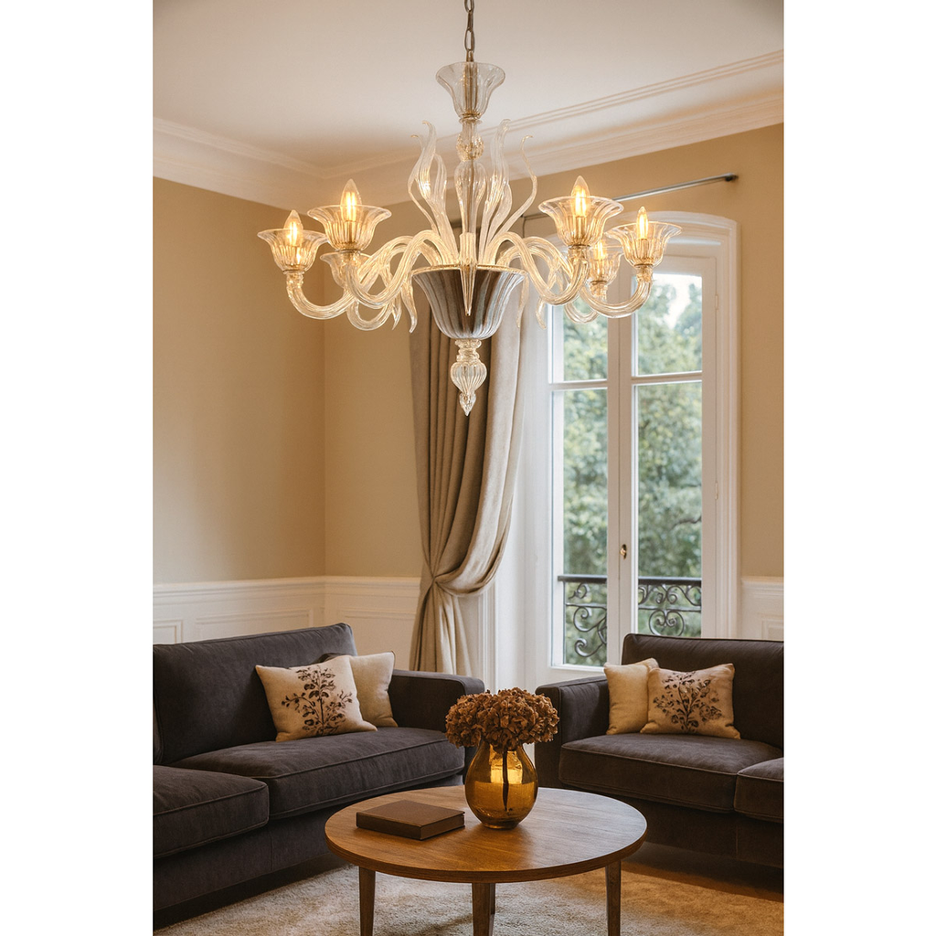
This structure makes the space more useful in daily life. Instead of staying unused, the outdoor area becomes part of normal living. People naturally spend more time outside because the space supports their needs.

In modern United States homes, outdoor living is a common lifestyle element. Families use backyards for social events, rest, and even work. This design approach supports that behavior in a simple way.

Here, it’s crucial to remember that function comes first. Structure, not ornamentation, adds beauty. This makes the area useful and simple to manage.

This idea also relates to home styling because outdoor areas become part of the overall home experience.

4 Minimal and simple structure in modern outdoor design inspired by Roger Morph

kdarchitects landscape ideas by roger morph

The fourth idea in kdarchitect’s Roger morph principles is simplicity. The design avoids unnecessary elements and focuses on clarity.

The layout remains open rather than overcrowding the area with elements.This gives the landscape room to breathe. It also helps people move through the space without confusion.

Paths are direct and easy to follow. Plant arrangements are not overly dense. Built features are only added when they serve a clear purpose.

This approach creates a calm outdoor environment. Nothing feels crowded or overwhelming. The design feels organized without being complicated.

Simplicity also helps with maintenance. Fewer elements mean less cleaning, fewer repairs, and lower long term effort. This is one reason why this style is becoming more popular in the United States.

It also connects with modern home decor tips because interior and exterior spaces are both moving toward simple and functional design instead of heavy decoration.

A minimal landscape does not depend on trends. It stays stable over time because it is based on structure and balance.

5 Indoor outdoor connection in modern landscape design by Roger Morph 

kdarchitects landscape ideas by roger morph

The fifth idea in kdarchitect’s Roger morph designs is connection. The aim is to reduce the gap between indoor and outdoor spaces.

This is done through simple continuity in design. Sometimes the same materials used inside the house are carried outside. Floor levels are kept aligned so you don’t feel a break when stepping out. Large glass doors or open frames also help the space feel more open and linked.

It also fits with latest decoration trends mintpaldecor because modern design is moving in this direction. People now prefer homes where inside and outside don’t feel separate, just one easy, flowing space.

When this connection is strong, the home feels larger. Outdoor areas are not treated as separate zones. They become part of daily living space.

These days, patios and gardens are more than just outdoor spaces they’re part of the home. You can step right from the kitchen or living room into the yard, and it just feels easy and comfortable, like the indoors and outdoors are one.

The transition is not sudden or disconnected.

This idea also connects with interior decorating guide because both indoor and outdoor design follow the same visual language. Colors, materials, and structure feel consistent throughout the home.

In kdarchitects’ roger morph landscape ideas for modern design, this connection is one of the strongest design principles because it changes how people experience their home as a whole.

Conclusion

kdarchitects landscape ideas by roger morph

The 5 kdarchitects landscape ideas by roger morph for modern design focus on real function, natural balance, and simple structure. Each idea works together to create outdoor spaces that feel natural and practical.

Instead of forcing nature into a fixed design, this approach just lets the land lead the way. It uses what’s already there, picks materials that actually belong in the environment, and keeps real life use in mind from the start. It’s not about making things look perfect. It’s about making them work.

In the end, you get a landscape that stays useful without constant effort, doesn’t feel high maintenance, and fits the way people in the United States actually live today.

10 Modern Home Decor Tips for a Luxury Look Without High Cost

A home can look expensive without costing a lot. Most people think luxury means big budgets, but that is not always true. What matters more is how you use space, light, and simple design choices. Many top designers follow the same basic rules. They focus on clean layouts, neutral colors, and smart furniture choices.

This is where modern home decor tips become useful. They assist you in creating a serene, well-organized, and luxurious atmosphere without going over budget. Everything in your house doesn’t need to be replaced. Little adjustments can affect the entire appearance.

This handbook contains useful suggestions that are implemented in actual households around the United States.These tips are based on what designers actually use today. You will learn how to use lighting, textures, and layout in a simple way.Additionally, you will learn how to steer clear of typical errors that give the impression that a house is cheap.

If you want a clean and modern look that feels comfortable and not forced, this guide will help you get there step by step.

1. Why Modern Home Decor Tips Make a Style Feel Luxurious 

modern home decor tips

Modern design feels expensive because it removes what is not needed. You see clean lines, open space, and calm colors. That alone changes how a room feels. According to design experts, modern spaces focus on simplicity and function instead of decoration overload.

When a room is not crowded, it looks bigger. Bigger spaces often feel more premium. That is one reason hotels and high-end homes follow this approach. They do not fill every corner.

Another reason is consistency. In many homes, styles are mixed without a plan. Modern design avoids that. It keeps everything connected. Furniture, colors, and materials all follow one idea.

If you are new to this, a simple interior decorating guide can help you understand how to keep things balanced. Eliminating personality is not the aim. The goal is to give each thing a sense of purpose.

This is one of the most important modern home decor tips to remember. Luxury is not about adding more. It is about choosing better.

2. Modern Home Decor Tips for Keeping Your Space Clean and Open 

modern home decor tips

Clutter makes a home feel smaller and cheaper. A clean space feels calm and expensive. That is why many designers start with removing items before adding anything new.

Modern homes often leave some empty space on purpose.It provides a resting spot for the eye. Research shows that open layouts improve how large a space feels, even in small homes.

Start with simple steps. Clear surfaces like tables and shelves. Save only what you really enjoy or utilize.Store the rest.

Open space also improves movement. Furniture should not block pathways. When people can walk freely, the home feels more organized.

For more ideas, many people look at decor inspiration online, but copying everything does not work. Focus on what fits your home size and lifestyle.

Among all modern home decor tips, this one gives fast results. You do not need money to declutter. You just need to be honest about what stays and what goes.

3. Use Neutral Colors the Right Way

modern home decor tips

Color sets the tone of a room. Modern homes use neutral shades because they feel calm and clean. Tones like white, beige, gray, and soft earth are popular.

Additionally, these hues reflect light more effectively. Rooms appear larger and brighter as a result.

But neutral does not mean boring. You can add depth with small accents. A dark cushion, a simple rug, or a piece of art can change the whole look.

Balance is key. Too many colors can make a space feel busy. Too little can feel flat. Try to stick with one base color and one or two accents.

Many Interior Design Tips suggest testing paint in natural light before choosing. Lighting can change how a color looks during the day.

This is one of the easiest modern decor ideas to apply. Paint is affordable and can transform a space quickly.

4. Add Texture for Depth

modern home decor tips

A modern home can feel flat if everything looks the same. That’s fixed by texture. Without creating clutter, it gives depth.

Think about mixing materials. A soft rug, a wooden table, and a metal lamp can work together. This creates contrast without using bold colors.

Design experts often use natural materials like wood and linen to make spaces feel warm.

You can also layer fabrics. Cushions, throws, and curtains all help. Just keep patterns simple.

Even small changes help. Changing cushion covers or adding a textured rug can shift the whole room.

Many people ignore this step, but it is one of the most effective modern home hacks for a luxury look.

5. Choose Simple and Functional Furniture

modern home decor tips

Furniture should look good and serve a purpose. Modern homes avoid heavy and detailed pieces. Clean lines work better.

Multi-use furniture is also helpful. Storage beds, foldable tables, and modular sofas save space and reduce clutter.

Avoid buying full matching sets. They can make a home feel basic. Instead, combine components that complement one another.

Doors are also more important than most people realize.Updating interior doors with simple designs can improve the overall look of your home.

One strong idea behind modern decor is function first. If something does not serve a purpose, it should not take space.

6. Improve Lighting for a High End Feel

modern home decor tips

Lighting can change everything. A well-lit room feels open and inviting. Poor lighting makes even a nice room look dull.

Natural light is the best option. Keep windows clear if possible. Light curtains help more than heavy ones.

For artificial lighting, use layers. Combine ceiling lights with lamps. This creates depth and comfort.

Experts say lighting should match the room’s use. Bright light for work areas. Softer light for relaxing spaces.

Trends like latest decoration trends mintpaldecor show that warm lighting is becoming more popular in modern homes.

Because it works in any space, this is one of the most useful modern home suggestions.

7. Use Statement Pieces with Purpose

modern home decor tips

You do not need many decorations. One strong piece can do more than ten small ones.

This could be a large painting, a mirror, or a unique chair. It should stand out but still match the room.

Modern design avoids filling walls with too many items. Instead, it focuses on one focal point.

A good example from mintpaldecor home hacks from myinteriorpalace shows how one large mirror can make a room feel bigger and brighter.

This approach saves money and keeps the space clean. It is one of the smartest  home decor ideas for beginners.

8. Bring Nature Into Your Space

modern home decor tips

Plants make a home feel fresh. They also improve mood and air quality.Modern design often includes natural elements. Wood, stone, and plants all help create balance.

You do not need many plants. One or two in the right place is enough.If real plants are hard to manage, simple alternatives can still add a natural touch.

This idea is simple but powerful. It connects your home to a calm and natural feel.

9. Focus on Small Details That Matter

modern home decor tips

Luxury often comes from small details. Clean finishes, neat edges, and well-placed items all matter.

Simple upgrades can help. Change handles, update light switches, or replace old curtains.Keep things aligned. Crooked frames or uneven spacing can make a space feel messy.

This is where a lot of houses fall short. They overlook minor changes in favor of major ones.

Among all modern home decor tips, this one is often missed but very important.

10. Avoid Common Decor Mistakes

modern home decor tips

Some choices can make a home look cheap even if you spend money.Too many decorations is one problem. Matching everything is another. Experts also warn against clutter and poor layout choices.

Avoid trends that do not fit your space. Not every idea works in every home.

Take your time when decorating. Good design grows slowly.

When you avoid these mistakes, your home naturally starts to look better without extra cost.

Conclusion

modern home decor tips

Creating a luxury look does not require a big budget. It requires clear choices. Clean space, good lighting, and simple design can change everything.

These modern home decor tips are easy to follow and work in real homes. Begin modestly. Concentrate on one room at a time.

Your room will eventually feel more airy, serene, and sophisticated. That is what modern design is really about.