
Understanding the effects of warm and cool tones is essential when working with stone and tile. The type of undertones influence the appearance of the materials, how they interact with one another, and with the overall design of the space. Getting them right can mean the difference between a cohesive look and one that feels slightly off. Although color is generally the first thing people notice, undertones are what truly determine balance in a design.
What Are Warm and Cool Tones?
Warm tones are typically colors that include more hints of:
- Red
- Orange
- Beige
- Cream
- Gold
- Brown
Cool tones, on the other hand, feature more shades of:
- Gray
- Blue
- Green
- Purple
- White with crisp or icy undertones
Because many natural stones have elements of both warm and cool, it is important to identify the subtle undertones before selecting other materials.
Why Undertones Matter in Design
Unintentional mixing of warm and cool tones can create visual discord. Even if two materials appear similar at first glance, clashing undertones can make a space feel disjointed. When choosing materials, designers focus on undertones because they:
- Affect how colors appear under different types of lighting
- Influence the mood of a space (warm = cozy and inviting, whereas cool = calm and modern)
- Impact how well materials coordinate with each other as well as with cabinetry and flooring
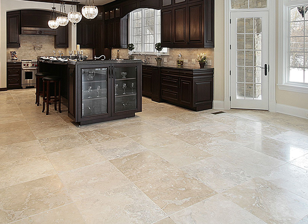
For example, combining a cool gray quartz countertop with warm wood cabinetry can feel mismatched unless they are balanced with uniting elements.
How to Identify Undertones
Determining undertones isn’t always a straightforward process, especially with natural stone. Designers often use comparison as the most reliable method for identifying undertones and utilize techniques such as:
- Placing samples next to pure white to reveal hidden tones
- Comparing multiple slabs or tiles side by side
- Looking at the materials under both warm and cool lighting
- Distinguishing dominant colors in the veining or patterning
This process can help ascertain whether the undertones of a material are more warm, cool, or neutral.
Creating Balance Between Tones
While it is generally easier to stick with tones that are within the same family, mixing warm and cool can work when it is done intentionally. Effective strategies for doing this include:
- Using a neutral material that bridges the two tones
- Repeating each tone at least twice within the space
- Incorporating texture to soften the contrast
- Choosing finishes that complement both tones
For instance, a neutral backsplash can help tie the cool countertops and warm cabinetry together.
Achieving a Cohesive Look Across Materials
Successful designs don’t happen by accident – they are a result of careful planning and coordination. By paying close attention to undertones and evaluating materials together, it is possible to create spaces that feel balanced and are visually appealing. When warm and cool tones are incorporated correctly, they can add depth and sophistication rather than causing dissonance within the design. Taking the time to consider these details when choosing stone and tile results in a finished space that feels both intentional and refined.